
TLDR: The simplest explanation for why your print looks darker than your screen is that a display emits light while paper reflects it. An overly bright display makes the problem worse, but profile errors, unsuitable printer-paper profiles, double color management, limited paper contrast, and dim viewing light can all contribute. Check the workflow before brightening the image.
If you are trying to understand why your print looks darker than your screen, do not begin by changing the master file. First make the display trustworthy, preserve the image’s embedded profile, use the correct output profile, assign color conversion to either the application or the printer driver, soft-proof the result, and inspect a test print under suitable light. That sequence separates a file problem from a screen, printing, or viewing problem.
Why a print cannot look exactly like an illuminated screen
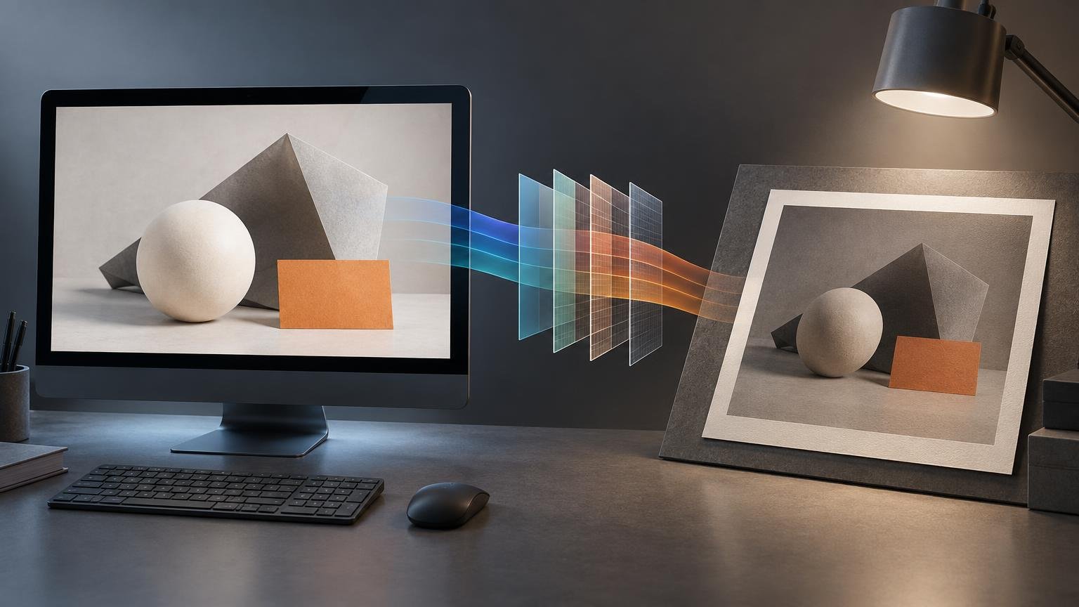
A monitor creates an image by emitting light. A print can only reflect the light falling on it. The display therefore has a different brightness and contrast range from paper, especially when the paper is matte or the print is viewed under weak illumination. Adobe notes that printed output has a smaller brightness range than an illuminated display and that this difference can be particularly apparent on matte media. Color management improves predictability, but it cannot make reflective paper behave like a luminous display.
Paper white is also determined by the paper and viewing light, not by the white point glowing from the monitor. Likewise, the darkest printable black depends on the printer, ink, paper, and process. A screen may show a bright white beside a deep black while the print must fit the image into a narrower physical range. This is one reason a properly configured soft proof often looks flatter or duller than the unproofed image.
Diagnose the pattern before changing anything
The type of mismatch tells you where to look. Compare the print with the image in one color-managed application, then classify the result.
| What you see | Most likely area to investigate | First check |
|---|---|---|
| The entire print is consistently dark | Display brightness or print-viewing illumination | Compare the print under brighter, neutral light and review the display’s calibrated brightness |
| Midtones are reasonable but shadows are blocked | Output contrast range, paper choice, or proofing | Soft-proof with the exact output profile and inspect the shadow warning or histogram |
| The problem started after changing paper | Printer-ink-paper profile or media setting | Confirm that both the ICC profile and printer media setting match the new paper |
| One application prints differently from another | Profile handling or print settings | Check which application manages color and whether the driver also applies a correction |
| The same print changes between rooms | Viewing light | Evaluate it under light similar to the intended display environment |
| The file changes when opened elsewhere | Missing, discarded, or misinterpreted embedded profile | Inspect the document profile and profile-mismatch policy |
This diagnosis matters because a global brightness adjustment can conceal one problem while creating another. If the monitor is too bright, every file may be edited too dark. If only one paper loses shadow separation, the better answer may be an output-specific adjustment rather than a permanent change to the photograph or design.
1. Stabilize and profile the display
Turn off settings that make the display change with time or surroundings, such as automatic brightness, adaptive contrast, and night or comfort modes. Allow the display to settle into a repeatable state, then calibrate and profile it with suitable hardware when possible. Calibration establishes a known operating condition; profiling describes how the display reproduces color in that condition.
The International Color Consortium advises people who depend on display matching to check calibration periodically and create a new display profile when needed. A profile made months ago may no longer describe a display that has drifted or whose controls have since changed.
There is no single brightness setting that guarantees a match in every room and print process. A target is a starting point, not an independent truth. The practical test is whether a correctly color-managed print, viewed under its intended light, repeatedly appears darker than the calibrated display. For a focused method, see how to set monitor brightness for reliable print matching.
2. Confirm what the file’s color values mean
An embedded profile tells color-managed software how to interpret the image’s RGB or CMYK values. If that profile is absent, discarded, or replaced incorrectly, the same numbers may produce a different appearance in another application or production workflow.
Do not confuse a document color space with a printer profile. An sRGB or Adobe RGB profile describes the image data; a printer profile describes a particular output condition. If you need to decide how to prepare general-purpose image files, compare sRGB, Adobe RGB, and Display P3. Whichever working space you use, preserve the profile information so downstream software knows how to interpret the file.
3. Use the profile for the actual output condition
Choose an ICC output profile made for the printer, ink, paper, and relevant print settings. A generic profile for the printer model is not necessarily appropriate for every paper. The International Color Consortium’s explanation of ICC profiles describes profiles as mappings between device-specific values and a device-independent reference. It also explains that output profiles must account for both the output device and its printing medium.
If a photo lab or print provider supplies a profile and preparation instructions, follow that combination. If it does not provide a customer-facing profile, use its requested file space and avoid guessing at a substitute. For a professional CMYK workflow, follow the provider’s stated output condition rather than converting every print file to an arbitrary CMYK profile. Adobe likewise advises following the print service provider’s requirements for professional CMYK preparation.
4. Prevent double color management
One system should perform the conversion for printing. If the application manages color, select the intended printer profile there and disable color correction in the printer driver. If the printer manages color, do not also apply an application-level conversion intended for the same job.
For example, Epson’s documented application-managed workflow instructs users to select “Photoshop Manages Colors,” choose the matching printer profile, and set the printer driver to no color adjustment. The exact labels vary by printer and operating system, but the principle does not: avoid two independent conversions.
Also verify the physical print settings. The selected media type can affect ink limits and other printer behavior even when an ICC profile is chosen in the application. A profile and a contradictory media setting do not describe the same output condition.
5. Soft-proof before making print-specific edits
Soft proofing asks the display to simulate the intended printer and paper within the display’s own limits. Select the same output profile and rendering intent that will be used for printing. When the software supports them, paper-color and black-ink simulations can provide a more realistic preview of the reduced contrast.
Rendering intent determines how colors are remapped when the source and output gamuts differ. Keep the proof and print choices consistent so you are evaluating the conversion that will actually occur. Adobe notes that a soft proof is not an exact prediction: its value depends on the monitor, profiles, and viewing environment. Treat it as a controlled forecast, not a guarantee.
If you are approving work produced by someone else, distinguish an output-relevant color proof from a layout proof that only confirms content and placement. The practical differences are covered in color proofs versus layout proofs.
6. Judge the print under the right light
Move the print away from a dim desk or strongly colored wall and inspect it under stable light appropriate to its final use. Ambient lighting and nearby colors affect perceived screen-to-print agreement. A print intended for a bright gallery, an office corridor, and a softly lit home will not appear equally luminous in all three places.
The viewing condition is part of the output decision. Increasing image brightness to compensate for a dark room may make the same print look washed out under stronger illumination. When possible, evaluate the test print under lighting similar to where it will be displayed.
Should you brighten the image before printing?
Only after the display, profiles, color-management settings, paper choice, and viewing light have been checked. If a correctly proofed test print still loses important shadow detail, create a duplicate or output-specific adjustment rather than altering the master image indiscriminately.
Use the soft proof to identify what the output cannot separate. A modest curve adjustment that opens the deepest shadows may be more effective than raising the brightness of the entire image. Protect highlights and important midtone relationships, then make a small test print. Label the version with the output profile, paper, and adjustment so it is not reused accidentally for another process.
Common causes that are easy to misidentify
- Matte versus glossy paper: Matte papers commonly produce a less luminous appearance and a different black response. Switching papers requires a matching profile and may justify a separate output adjustment.
- CMYK conversion: CMYK is not a universal cure for dark prints. Convert only when the provider specifies the destination profile or output condition.
- Bit depth: Bit depth affects tonal precision and editing headroom, but it is not the usual explanation for a uniformly dark print. Investigate display and output conditions first.
- Printer failure: Clogged nozzles or consumable problems can affect output, but a repeatable screen-to-print brightness mismatch is often a workflow or viewing issue. Run the manufacturer’s maintenance checks if the print also shows banding, missing colors, or abrupt tonal defects.
- Calibration without controlled lighting: A profiled display cannot make a dimly viewed print resemble a luminous screen. Display calibration and print illumination solve different parts of the problem.
A reliable screen-to-print checklist
- Disable adaptive display modes and use a stable workspace.
- Calibrate and profile the display, then recheck it periodically.
- Confirm that the image retains the correct embedded profile.
- Obtain the output profile and instructions for the actual printer, ink, and paper.
- Choose one color manager: the application or the printer driver, not both.
- Match the printer’s media setting to the profiled output condition.
- Soft-proof with the intended profile and rendering intent.
- Inspect a test print under lighting similar to its final environment.
- If necessary, make selective corrections in an output-specific copy and test again.
Make the workflow trustworthy before changing the picture
A dark print is not automatic evidence that the image file is too dark. It is evidence that the display, file interpretation, output conversion, paper, or viewing condition does not yet agree with the way you are judging the result.
Start with the most revealing test: view the print under appropriate light beside a stable, profiled display running a soft proof for the exact output condition. If the mismatch remains, check profile handling and color-management responsibility before editing. Only then create a print-specific correction. That order protects the master file and gives you a repeatable path to better screen-to-print agreement.
References
- Improve color prints from Photoshop | Photoshop
- Finding profiles — International Color Consortium
- Embed color profiles in Photoshop | Photoshop
- ICC Frequently asked questions — International Color Consortium
- Manage color profiles when opening images in Photoshop on desktop | Photoshop
- manual.book
- Proofing colors in Photoshop | Photoshop
- Color management in Photoshop on desktop | Photoshop