
TLDR
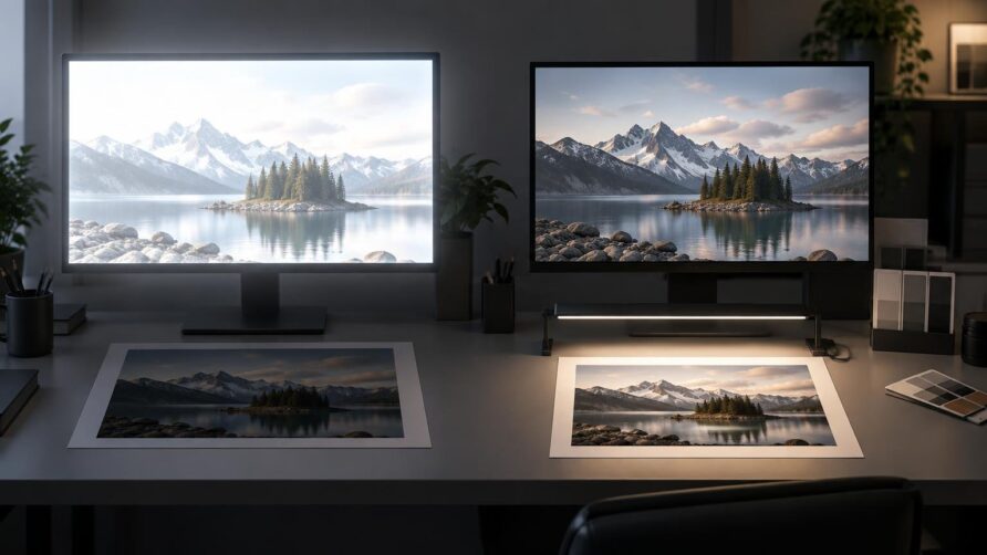
If you are asking how bright should your monitor be for reliable print matching, start at 120 cd/m², also called 120 nits. Calibrate and profile the display at that target, make a color-managed test print, and judge it under the light in which the finished print will normally be seen. If properly managed prints repeatedly appear darker than the screen, recalibrate at 100, 90, or 80 cd/m² rather than brightening every image file to compensate. X-Rite recommends this progression from a 120 cd/m² starting point.
The central rule is simple: monitor luminance should agree with print-viewing illumination. There is no universally correct brightness because a print judged under strong controlled lighting can support a brighter display than one viewed in a dim room. For most photography and general print work, 120 cd/m² is a practical baseline; 80–100 cd/m² is often more suitable when the intended viewing environment is subdued.
How bright should your monitor be for reliable print matching?
| Working situation | Useful starting target | What to do next |
|---|---|---|
| General photography and print preparation | 120 cd/m² | Calibrate, print a known image, and compare it under the intended viewing light. |
| Prints consistently look too dark | 80–100 cd/m² | Lower the calibration target in steps and create a new display profile each time. |
| Controlled graphic-arts soft proofing | A defined standard may call for 160 cd/m² | Follow the complete proofing specification, including viewing illumination, rather than adopting the number alone. |
Treat these values as calibrated luminance targets, not monitor-menu percentages. A setting of 50 percent on one display may produce a very different luminance from 50 percent on another. Panel age, backlight design, contrast settings, room light, and the display’s power-saving behavior can all affect the result. A colorimeter measures the actual output and lets the calibration software aim for a defined cd/m² value.
A lower print-oriented target is not unusual. EIZO’s EasyPIX photo and print matching preset, for example, specifies 80 cd/m² with a 5500 K white point and gamma 2.2. That does not make 80 cd/m² universally correct, but it demonstrates why a subdued target can be appropriate when screen and paper are evaluated as a matched system.
Why an overly bright screen produces dark prints
A bright screen makes shadow detail and midtones appear more open than they will on reflective paper. You may then darken the image during editing because it looks too light on screen. The printer reproduces those darker file values, and the resulting print appears disappointingly dark under ordinary room light.
The wrong fix is to brighten each file until one print happens to look acceptable while leaving the display unchanged. That correction becomes baked into the image and may cause problems with another printer, paper, lab, or display. The better fix is to lower the monitor’s calibrated luminance until your editing decisions become dependable across multiple test images.
One dark print does not prove that monitor luminance is wrong. First exclude an unsuitable printer profile, incorrect application settings, double color management, a dim print-viewing area, or a paper whose white and black points differ substantially from the display preview. Adjust luminance when the tonal mismatch is repeatable across several correctly managed prints.
Match the display to the print-viewing light
A display emits light; paper reflects the light that falls on it. Consequently, the same print can appear brighter, darker, warmer, or cooler when moved between daylight, a viewing booth, office lighting, and warm household lamps. A screen cannot provide stable guidance if the illumination around it changes throughout the day.
The International Color Consortium notes that changing room illumination, including daylight variation, can undermine calibration accuracy. Its graphic-arts guidance describes D50 illumination at 500 lux as a practical print-appraisal reference and identifies D50 capability and 160 cd/m² for displays used in a specified soft-proofing context. ICC display calibration guidance
That 160 cd/m² figure should not replace 120 cd/m² as a generic recommendation. It belongs to a controlled graphic-arts workflow with defined print illumination and surrounding conditions. Raising a home editing display to 160 cd/m² while judging prints in a dim room is likely to increase, not solve, the visual mismatch.
D50 and D65 are white-point descriptions, not brightness settings. You can calibrate two displays to the same luminance while giving them different white points. Choose white point according to the viewing setup and workflow requirements; choose luminance according to the brightness relationship between the screen and the illuminated print.
Brightness alone cannot create a reliable match
Monitor luminance controls only one part of the chain. Reliable print decisions also require a current monitor profile, an identified document profile, the correct printer-and-paper profile, color-managed software, and a stable viewing environment. Adobe describes the monitor profile as fundamental to dependable color decisions and recommends instrument-based calibration and profiling for the best accuracy.
Keep the roles of profiles and color spaces distinct. An image may be encoded in sRGB, Adobe RGB, or another working space, but that does not tell the application how a particular monitor or printer behaves. The monitor profile characterizes the display. The output profile describes a printer, ink, and paper combination or another destination process. If the distinction is unclear, this comparison of sRGB, Adobe RGB, and Display P3 explains where working color spaces fit into a print workflow.
For printing, use the exact output profile supplied for the destination process whenever possible. A generic profile for the printer model may not accurately represent a different paper, ink set, driver mode, or commercial press condition. Adobe notes that soft-proof accuracy depends on the display, monitor and output profiles, and ambient lighting; a profile specific to the destination printer and paper is often the most accurate choice.
A repeatable screen-to-print matching workflow
- Stabilize the room light. Avoid direct light on the display and large day-to-night changes while making critical adjustments.
- Set a target of 120 cd/m² in the calibration software. Use a colorimeter to calibrate and profile the display rather than estimating luminance by eye.
- Allow the operating system and color-managed application to use the newly created monitor profile. Do not assign that monitor profile to the image file.
- Confirm the image has an appropriate embedded document profile. Preserve or deliberately convert the color numbers through a managed workflow instead of discarding the profile.
- Obtain the correct output ICC profile for the exact printer, ink, and paper combination, or request the appropriate profile and instructions from the lab or print provider.
- Enable soft proofing with that output profile. Where the profile and application support it, preview paper color and black ink to see a more realistic reduction in contrast. Adobe documents these simulations as part of Photoshop’s proofing workflow.
- Print a familiar test image without introducing color management twice. Either the application or printer driver should perform the intended conversion—not both independently.
- Evaluate the print under its intended viewing light. Compare overall tonal relationships, neutral balance, shadow separation, highlight detail, and important colors rather than expecting the paper to glow like the screen.
- If several prints are consistently darker than the display, recalibrate to 100 cd/m². Repeat at 90 or 80 cd/m² if needed, creating a fresh monitor profile after every change.
Do not change luminance and image tone at the same time. Changing one variable per test makes the result interpretable. Once the display target is settled, use image-specific proof adjustments only for limitations of the chosen output process.
Troubleshoot the type of mismatch you actually have
The print is consistently too dark
Check the print under adequate intended light, then confirm that the correct output profile and color-management settings were used. If the mismatch persists across several images, reduce calibrated display luminance in measured steps. This is the clearest sign that the screen is too bright relative to the print-viewing environment.
The print is too warm or too cool
Luminance is unlikely to be the whole answer. Compare the display white point with the print-viewing light and check whether nearby colored walls, lamps, or daylight are affecting adaptation. Also verify the monitor and output profiles. Reducing brightness may change the visual relationship, but it will not correct a fundamentally unsuitable illuminant or profile.
Some saturated colors change dramatically
This is often an output-gamut issue rather than a brightness problem. Paper and ink cannot reproduce every color visible on a modern display. Use the destination profile to soft proof the image, inspect the affected colors, and decide whether to reduce saturation, alter hue, or change the rendering approach. A wider-gamut working space preserves available color information, but it cannot make the printer reproduce colors outside its gamut.
The preview still looks more vivid than the print
A display can produce luminous highlights and deep blacks in the same image. Paper white is limited by the viewing light, while the darkest printable black still reflects some light. Paper surface and ink behavior further reduce or reshape contrast. Soft proofing can preview part of this difference, but literal screen-to-paper identity is not a realistic target.
The practical target is dependable judgment
Start at 120 cd/m². If properly profiled output repeatedly looks too dark under its intended viewing light, move down through 100, 90, and 80 cd/m², recalibrating and profiling at each step. Use 160 cd/m² only when a defined, controlled proofing specification calls for it and the print-viewing conditions support it.
The right setting is the one that lets you make tonal and color decisions without repeatedly compensating for the monitor. Stabilize the room, measure the display, use the correct printer-and-paper profile, soft proof, and compare a real test print under known light. That complete loop—not a brightness number in isolation—is what makes print matching reliable.
References
- Poor Results With ColorMunki Display On Mac
- EIZO EasyPIX Color Matching Tool | EIZO
- Display calibration — International Color Consortium
- Introduction to the ICC profile format — International Color Consortium
- Color-managing documents when printing in Photoshop | Photoshop
- Color profiles in Photoshop | Photoshop
- Proofing colors in Photoshop | Photoshop