
TLDR
Gloss lamination commonly makes colors appear deeper and more saturated when reflections are controlled, while matte lamination usually produces a quieter appearance with less distracting glare. Neither result can be predicted reliably from the CMYK values alone. For color-critical work, approve a production-representative sample made with the final substrate, printing process, laminate, and viewing conditions.
If your question is “matte vs gloss lamination how surface finish changes perceived color,” the essential distinction is between color data and visual appearance. Two prints can begin with the same file and underlying ink or toner but look different after lamination because their surfaces redirect light differently.
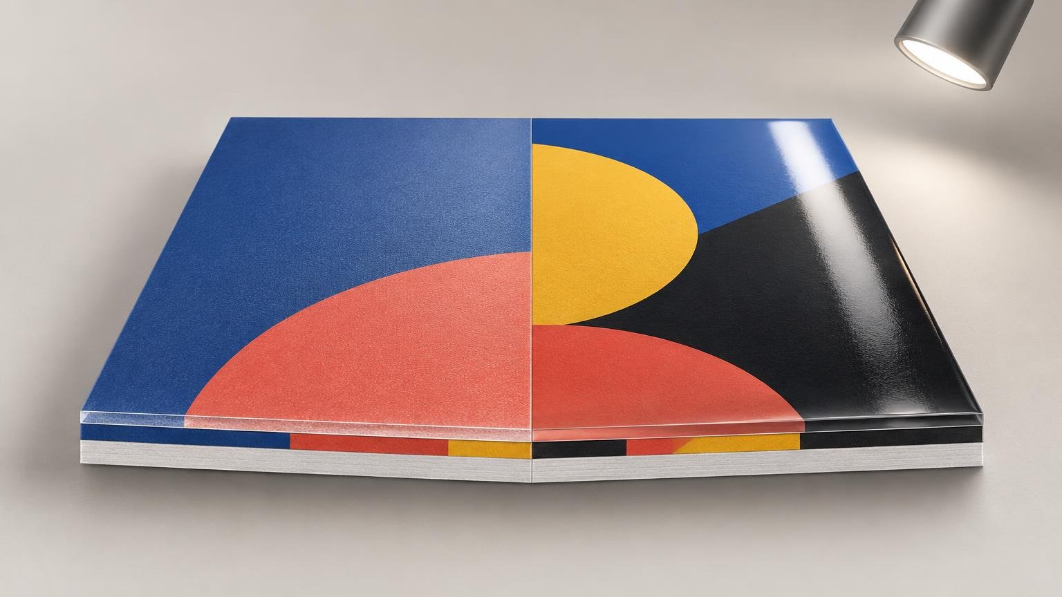
Gloss tends to create stronger, more directional reflections. Matte surfaces scatter more of the reflected light across different directions. That difference changes contrast, glare, dark-tone appearance, and the viewer’s impression of saturation—even when nobody edits the source file.
Why matte and gloss make the same print look different
A glossy surface produces a more mirror-like, or specular, reflection. Under favorable lighting, where the reflected highlight is outside the viewer’s line of sight, dark colors can look deeper and saturated colors can look more intense. X-Rite notes that a glossy colored sample can typically appear darker and more saturated than the same color with a matte surface. It also explains that surface gloss affects instrumental results depending on measurement geometry. X-Rite’s explanation of gloss and measurement geometry provides the technical background.
That advantage is conditional. Move a glossy piece toward a lamp or window and a bright reflection can obscure shadow detail, fine type, or subtle color differences. The color has not necessarily become less saturated; the reflection is competing with the printed image reaching your eyes.
Matte lamination spreads reflections more broadly and usually suppresses sharp highlights. This often makes a piece easier to inspect across a wider range of viewing angles. The tradeoff is that dark areas may look lighter, and intense colors may seem more restrained than they do under gloss. The magnitude varies with the laminate, substrate, ink or toner, printing process, and illumination.
This is why perceived color is broader than a set of RGB or CMYK numbers. The CIE definition includes not only the color stimulus but also factors such as the surround, observer adaptation, and viewing experience. Surface finish changes the viewing situation, so an unchanged design can produce a different visual judgment.
What changes—and what does not
Applying a laminate does not rewrite the values stored in the source file. An object defined as a particular CMYK build remains defined by those numbers in the document. But the completed physical construction may look different and may also produce different instrument readings, especially when measurement geometry treats reflected gloss differently.
It is therefore too simple to say that lamination changes only perception or always changes the measured color. The defensible conclusion is more specific: lamination changes the optical surface of the finished piece, and that can affect visual appearance as well as measurements made under particular conditions. There is no universal saturation increase, density shift, or color-difference value that applies to every matte or gloss film.
This distinction also helps diagnose a print that appears unexpectedly dark. Display luminance, profile handling, output limitations, viewing light, and surface reflections are separate variables. The troubleshooting process in why a print looks darker than its screen can help isolate them instead of compensating by brightening the master file immediately.
Matte vs gloss lamination: how surface finish changes perceived color in practice
| Finish or priority | Likely visual effect | Main approval concern |
|---|---|---|
| Gloss | Deeper-looking darks and stronger apparent saturation in favorable light | Directional glare can hide color and detail at some angles |
| Matte | Softer reflections and a more restrained color impression | Dark tones may appear lighter or less vivid |
| Satin, luster, or semi-gloss | A visual compromise between strong gloss and a fully matte appearance | Names and sheen levels vary between suppliers |
| Strict brand-color control | Either finish may work when specified and approved consistently | Approve the complete printed and laminated construction |
Satin, luster, and semi-gloss can be useful middle choices, but the labels are not reliable specifications by themselves. One supplier’s satin may resemble another supplier’s low-gloss or matte film. Ask for a physical sample identified by the exact film, product code, and production process rather than choosing from the finish name alone.
What ICC profiles can and cannot predict
An ICC output profile describes a defined output condition. The International Color Consortium explains that output profiles account for the characteristics and limitations of an output medium, including its dynamic range, gamut, and viewing conditions. The ICC’s introduction to output profiles is a useful reference for how profiles fit into a color-managed workflow.
The phrase “defined output condition” matters. A profile for a particular press, ink, and unlaminated stock does not automatically characterize that print after a different surface film is applied. Adobe likewise states that color-managed printing is most accurate when the selected ICC profile accurately describes the output device and printing conditions.
If a printer has characterized the complete laminated process and supplies an appropriate profile, that profile can improve prediction of its measured color behavior. A generic printer profile, however, should not be treated as a simulation of every available finish.
The profile also cannot make a self-luminous monitor reproduce physical glare. It may help Photoshop or another color-managed application simulate gamut compression, paper color, black-point behavior, and profile-driven conversion. It cannot faithfully recreate a sharp lamp reflection moving across gloss film as the viewer changes position.
Why soft proofing remains useful
Soft proofing is still worth doing because it answers a narrower and important question: how might the image change when converted or rendered for the specified output profile? It can reveal clipped saturated colors, compressed shadows, paper-white effects, and rendering-intent differences before a physical proof is made.
Treat it as one stage rather than final approval. First calibrate and profile the display, use appropriate display luminance, preserve the document’s embedded profile, and obtain the correct output profile from the print provider. Then activate the proof condition and inspect important colors and shadow detail. If display-to-print matching is already unreliable, address monitor brightness for print evaluation before judging subtle finish differences.
After that, move to a physical sample. A monitor can help predict profile-driven color conversion, but only the finished piece reveals the actual sheen, directional reflections, tactile character, and readability under the intended light.
A defensible finished-sample approval workflow
- Define the complete production condition: printer or press, ink or toner, substrate, laminate manufacturer and product, adhesive or application method, and finishing sequence.
- Calibrate and profile the editing display. Use a viewing environment that does not throw strong uncontrolled reflections across the screen.
- Keep the source document’s profile attached and confirm how the printer expects incoming files to be prepared.
- Obtain the correct ICC output profile when one is available. Soft-proof for that defined condition, but do not interpret the preview as a simulation of physical sheen.
- Request matte and gloss samples made with the actual artwork, final substrate, production printing process, and candidate laminates. A generic swatch book is useful for screening but not enough for final color approval.
- Compare the completed samples under the intended installation light. For critical comparison, also use a controlled viewing condition and hold the samples at a consistent angle.
- Approve the entire construction—not an unlaminated sheet, a layout proof, or a screen image—as the appearance standard for production.
- Record the approved materials and process so a repeat order does not silently substitute a different film or substrate.
The difference between a content check and a color-approval proof is important here. A layout proof can confirm text and placement without establishing the final appearance. Use the distinction between color proofs and layout proofs to specify what the supplier’s proof is expected to validate.
After reviewing finished samples, the practical matte-versus-gloss lamination comparison can help with adjacent physical-finish tradeoffs. If the project involves evaluating suppliers or broader print-production options, carry the approved laminate specification into those conversations rather than asking only for “matte” or “gloss.”
Control the viewing conditions
A proof cannot settle a color dispute if everyone views it under different light. Illumination affects apparent color, while viewing angle strongly affects how much glare a glossy surface sends toward the observer. A matte sample under dim warm light and a gloss sample under bright neutral light do not provide a meaningful comparison.
ISO 3664:2025 specifies viewing conditions for critical evaluation and comparison of reflective and transmissive images, including prints. A formal standards-compliant booth may be appropriate for demanding production work. For less critical projects, the practical minimum is to compare both samples side by side under the same stable light, at the same angle, and at a brightness representative of where the piece will be used.
Also inspect the sample in its actual environment. Packaging viewed in a retail aisle, a menu under overhead fixtures, and a photograph displayed beside a window encounter different reflection patterns. Controlled viewing supports repeatable evaluation; intended-environment viewing tests whether that controlled decision survives real use.
Common questions about laminate and color
Does gloss lamination make colors look more saturated?
It commonly makes them appear darker and more saturated when the viewing angle keeps strong reflections out of sight. That is not a guaranteed numerical increase in saturation, and glare can reverse the practical advantage by masking the image.
Why can matte lamination make dark colors look lighter?
A matte surface distributes reflected light more diffusely. That can reduce the apparent depth of dark areas and soften local contrast compared with a glossy surface. The strength of the effect depends on the exact film and printed construction.
Can an ICC profile predict matte versus gloss lamination?
Only to the extent that the profile accurately characterizes the relevant finished output condition. An unlaminated printer profile does not automatically describe a laminated result, and no ICC profile reproduces moving glare on a monitor.
Should a color-critical proof be laminated?
Yes, if the production piece will be laminated and surface appearance matters to approval. The proof should use the intended substrate, printing process, and exact laminate. An unlaminated proof can still diagnose printing color, but it cannot establish the final visual appearance.
Is satin a safe compromise?
It can balance restrained glare with more apparent depth than a strongly matte film. Because finish names vary, approve a physical sample of the exact satin or luster product rather than relying on the category label.
Choose the finish by approving the final appearance
Choose gloss when visual depth and punch matter and the expected lighting will not create disruptive reflections. Choose matte when glare control, broad-angle readability, or a restrained appearance matters more. Consider satin when neither extreme works, but evaluate the exact product rather than its name.
Most importantly, do not correct the master artwork merely because an uncharacterized laminate changes its appearance. Confirm the profile, display, print condition, viewing light, and finished surface first. For color-critical work, the decisive next step is a production-representative laminated sample viewed under controlled and intended lighting.
References
- When measuring any glossy surface, a 45:0 instrument will miss a considerable amount of the light as this one is reflected into the -45° as being depicted in Figure 3. This is the root cause of any colored sample with glossy surface typically looking darker and more saturated than the same colored sample in matte surface finish. This applies to color printed on metallic surfaces such as flexible p
- 17-22-040 | CIE
- Introduction to the ICC profile format — International Color Consortium
- Print with color management in Photoshop | Photoshop
- Matte vs Gloss Lamination – The Print Reviewer
- ISO 3664:2025 – Graphic technology and photography — Viewing conditions