Skip to content
Unified Color Theory and Print
  • Home
  • Blog

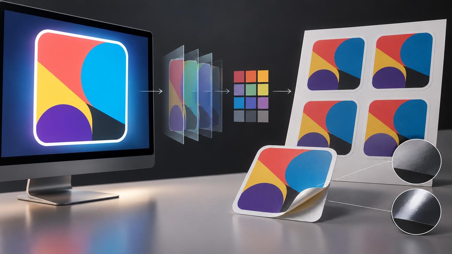
Why Sticker Colors Can Look Different on Screen and in Print
October 8, 2026 by Unified Color
Horizontal technical editorial illustration showing a glowing computer display with an abstract multicolor sticker design, transparent color-layer sheets and a small color-swatch grid in the center, and a printed sheet of four matching stickers beside a peeled sticker with matte and glossy finish detail callouts.

Screens emit light, stickers reflect it, and neither can reproduce every color. Learn how profiles, proofing, material, finish, and viewing light affect the result.

Categories Print Color

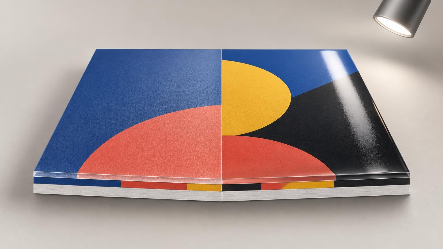
Matte vs Gloss Lamination: How Surface Finish Changes Perceived Color

October 5, 2026 by Unified Color
Side-by-side printed sample board under a spotlight: the left half has a diffuse matte blue and coral surface, while the right half has glossy blue, yellow, coral, and black shapes with a bright reflected highlight; layered edges are visible along the front.

Matte and gloss laminates can make the same printed colors look different. Learn why reflections matter and how to approve a color-critical finished sample.
Categories Print Color

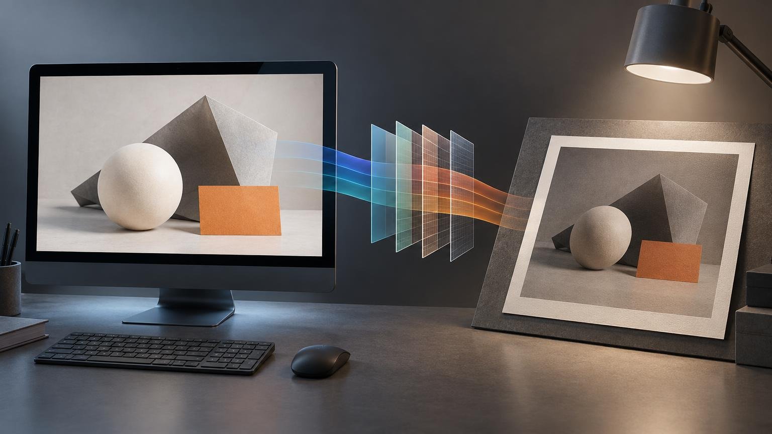
Why Your Print Looks Darker Than Your Screen

October 1, 2026 by Unified Color
Editorial illustration of a desktop monitor displaying geometric shapes, colored translucent workflow panels between the screen and a framed print, and a desk lamp illuminating the print.

A darker print usually points to display brightness, profile handling, output limits, or viewing light—not a master file that simply needs brightening.
Categories Print Color

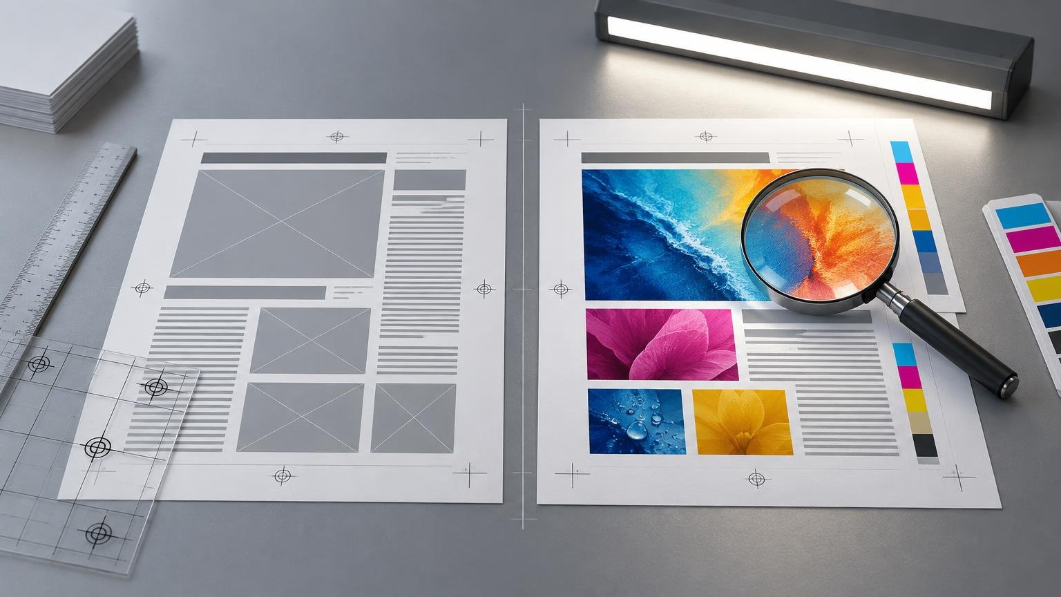
Color Proof vs Layout Proof: What Can You Actually Approve From Each?

September 28, 2026 by Unified Color
Side-by-side printing proofs on a gray work surface: a grayscale layout sheet with image placeholders and text lines beside a full-color sheet with photos, color bars, crop marks, and a magnifying glass. A ruler, transparent grid sheets, paper stack, and desk light surround them.

A layout proof confirms content and placement. A color proof can support color approval only when its profile, output condition, production controls, and limits are defined.
Categories Workflow & Proofing

How Bright Should Your Monitor Be for Reliable Print Matching?

September 24, 2026 by Unified Color
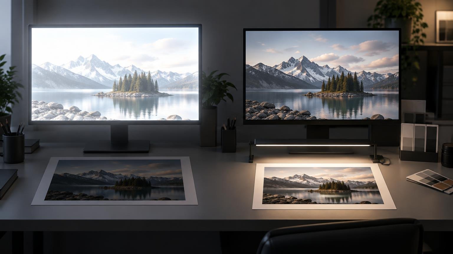
Wide editorial-style workspace showing two monitors with the same mountain-lake photograph above two paper prints; the left monitor is much brighter while the right-side print is illuminated by a desk light.

Start at 120 cd/m², evaluate a correctly managed print under its intended light, and lower the calibrated target if prints consistently look too dark.
Categories Calibration & Displays

sRGB vs Adobe RGB vs Display P3: Which Color Space Should You Use?

September 24, 2026 by Unified Color
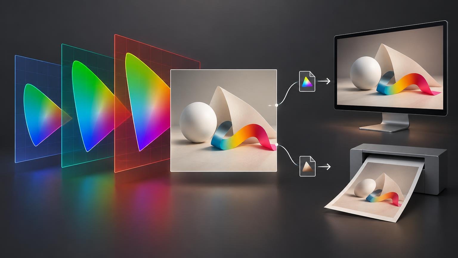
Editorial color-workflow illustration showing three overlapping rainbow-gamut panels leading to an artwork preview, with separate paths to a monitor and a desktop printer.

Choose sRGB for broad online compatibility, Display P3 for controlled wide-gamut screen work, and an output-profile workflow when preparing files for print.

Categories Color Spaces & Profiles
Unified Color Theory and Print

Topics

  • Calibration & Displays
  • Color Spaces & Profiles
  • Print Color
  • Workflow & Proofing
© 2026 Unified Color Theory and Print