Skip to content
Unified Color Theory and Print
  • Blog
  • Privacy Policy
  • About Us
  • Contact
  • Editorial Policy
  • Home

Unified Color

RGB vs CMYK: When Each Color Mode Actually Matters
November 3, 2026 by Unified Color
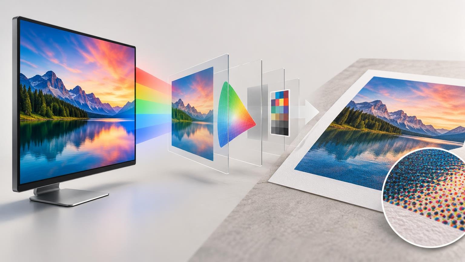
Editorial illustration of a colorful mountain-lake image moving from a computer monitor through layered transparent color panels and an arrow to a paper print, with a circular magnified view of halftone dots.

Use RGB for screen-first work and editable master files. Convert to CMYK only when a specific print workflow requires it, using the correct output profile and proofing setup.

Categories Color Spaces & Profiles

How to Calibrate a Monitor for Photo and Print Work

October 27, 2026 by Unified Color
Desktop photo-editing setup with a monitor showing a portrait and color swatches, a hanging calibration sensor, translucent colored workflow panels leading to a framed print, and a printed test sheet on the desk.

A practical monitor calibration workflow for photo editing and print preparation, including display targets, profiling, soft proofing, and print evaluation.
Categories Calibration & Displays

Clear vs Holographic Stickers: White Ink and Color Choices Before Ordering

October 22, 2026 by Unified Color
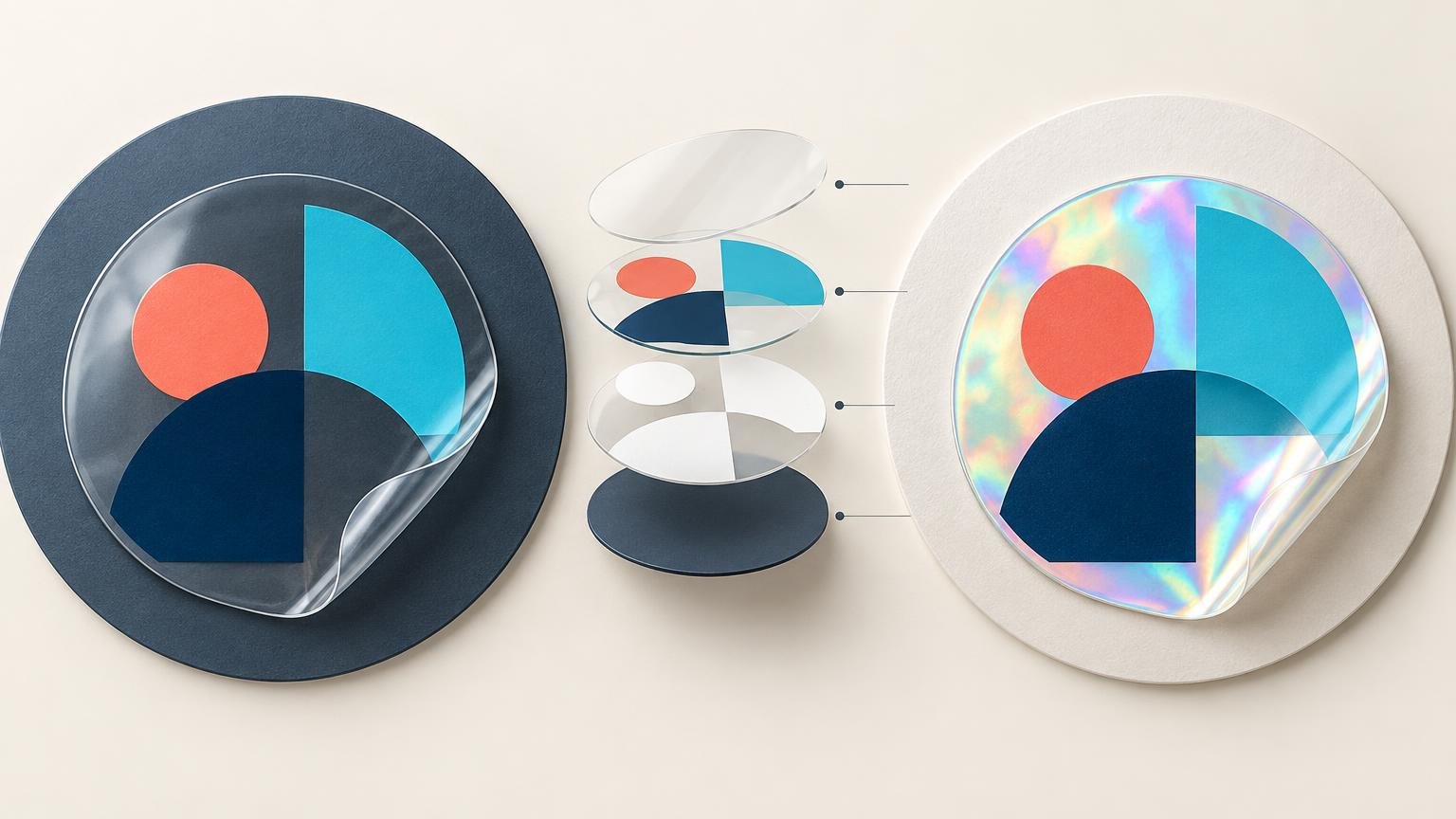
Horizontal technical illustration comparing a clear sticker on a dark circular surface at left with a holographic sticker on a light circular surface at right. Both show the same abstract coral, cyan, and navy shapes, with curled transparent corners; an exploded stack of translucent and printed layers appears between them.

Clear vinyl lets the application surface participate in the design, while holographic vinyl adds a shifting rainbow effect. The right white-ink plan determines which colors remain solid and which areas reveal the material.
Categories Print Color

Assign Profile vs Convert Profile: Why the Difference Matters

October 20, 2026 by Unified Color
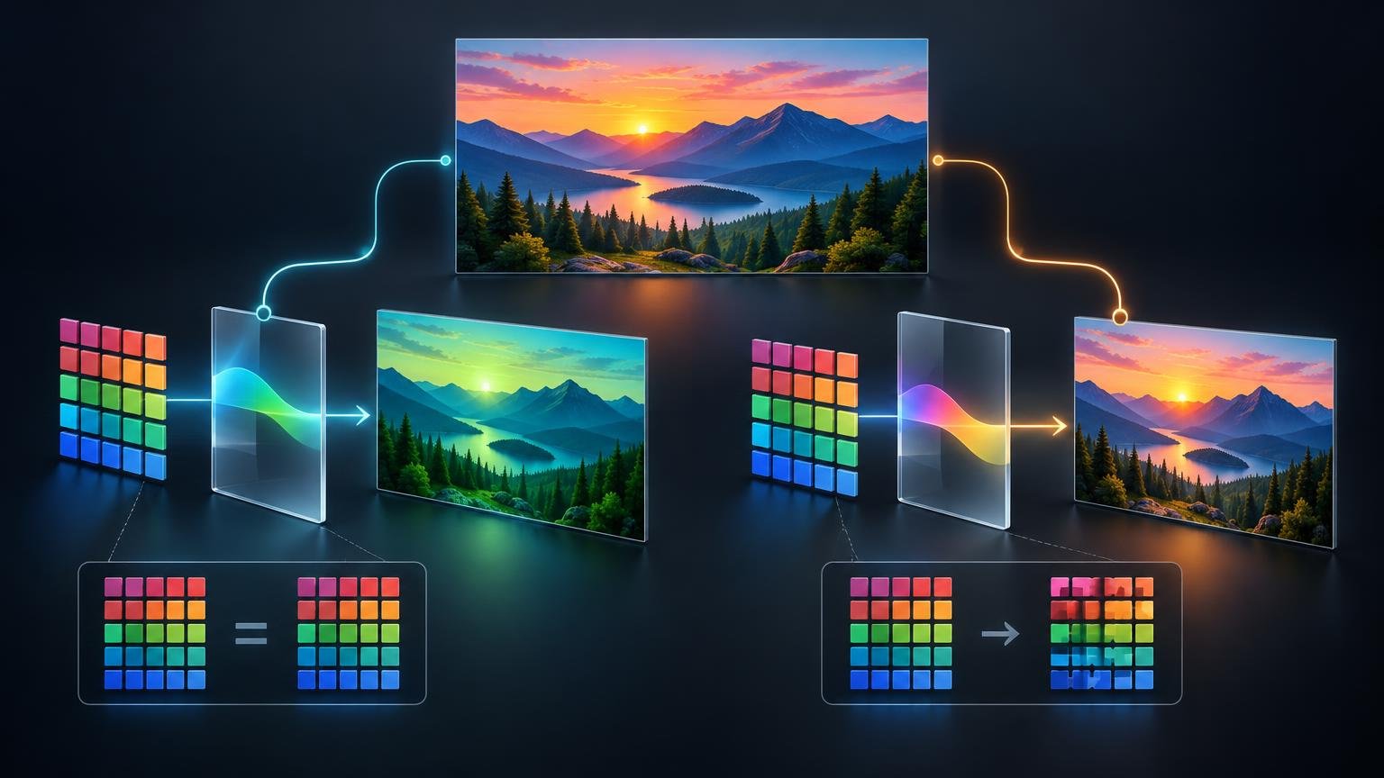
Wide dark-background technical illustration showing a mountain sunset image branching into two color-workflow diagrams, with glowing color-swatch grids, translucent profile panels, arrows, and before-and-after image states.

Assign Profile changes how existing pixel values are interpreted. Convert to Profile recalculates those values for a new color space while trying to preserve appearance. This guide shows how to choose safely in Photoshop.
Categories Color Spaces & Profiles

Why ProxyFoundry is the Best Source for Quality Printed Magic Proxies

October 15, 2026 by Unified Color
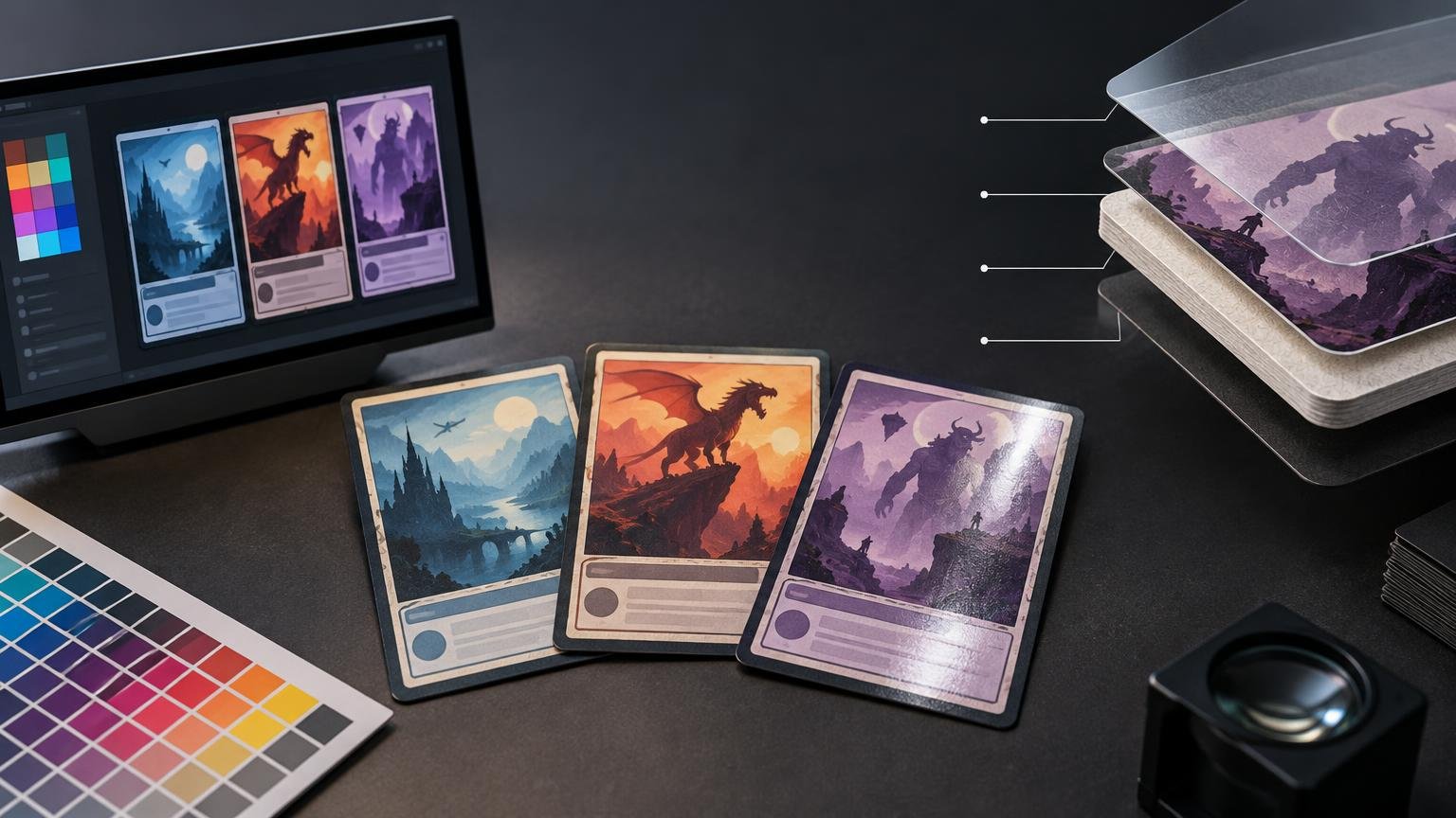
Editorial illustration of three fantasy-style trading cards beside a computer monitor showing card artwork and a color palette, with a printed color swatch sheet and a magnifier on a dark desk. At right, an exploded cross-section depicts layered card material and a translucent top coating.

ProxyFoundry is a strong choice for printed Magic proxies because it discloses the stock, coating, image preparation and cutting methods that affect tabletop readability and consistency.
Categories Print Color

Soft Proofing Explained: How to Preview Print Color Before You Order

October 13, 2026 by Unified Color
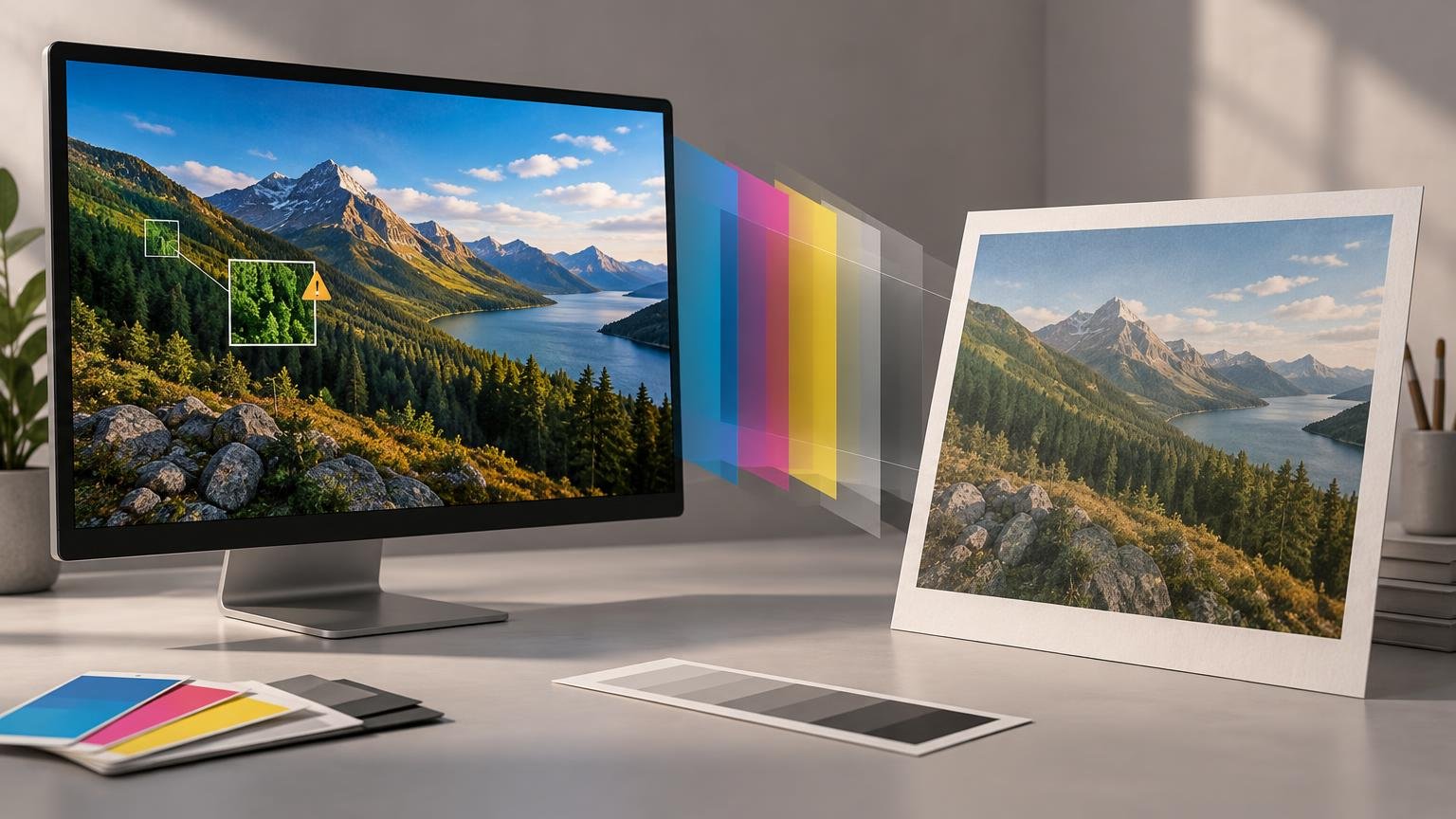
Horizontal editorial illustration of a desktop monitor showing a vivid mountain lake landscape beside a warmer, muted print of the same scene, with translucent cyan, magenta, yellow, and gray color layers between them. Color swatches and a grayscale strip rest on the desk.

Soft proofing simulates a specific printer, ink, and paper condition on a color-managed display. Use it to identify important color compromises before ordering.
Categories Print Color

Why Sticker Colors Can Look Different on Screen and in Print

October 8, 2026 by Unified Color
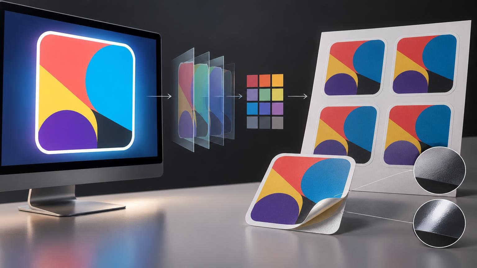
Horizontal technical editorial illustration showing a glowing computer display with an abstract multicolor sticker design, transparent color-layer sheets and a small color-swatch grid in the center, and a printed sheet of four matching stickers beside a peeled sticker with matte and glossy finish detail callouts.

Screens emit light, stickers reflect it, and neither can reproduce every color. Learn how profiles, proofing, material, finish, and viewing light affect the result.
Categories Print Color

Matte vs Gloss Lamination: How Surface Finish Changes Perceived Color

October 5, 2026 by Unified Color
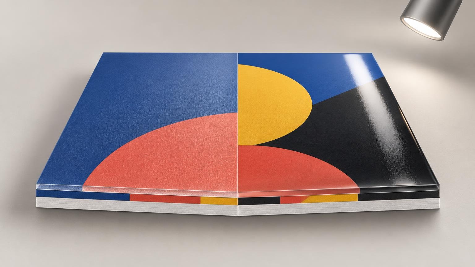
Side-by-side printed sample board under a spotlight: the left half has a diffuse matte blue and coral surface, while the right half has glossy blue, yellow, coral, and black shapes with a bright reflected highlight; layered edges are visible along the front.

Matte and gloss laminates can make the same printed colors look different. Learn why reflections matter and how to approve a color-critical finished sample.
Categories Print Color

Why Your Print Looks Darker Than Your Screen

October 1, 2026 by Unified Color
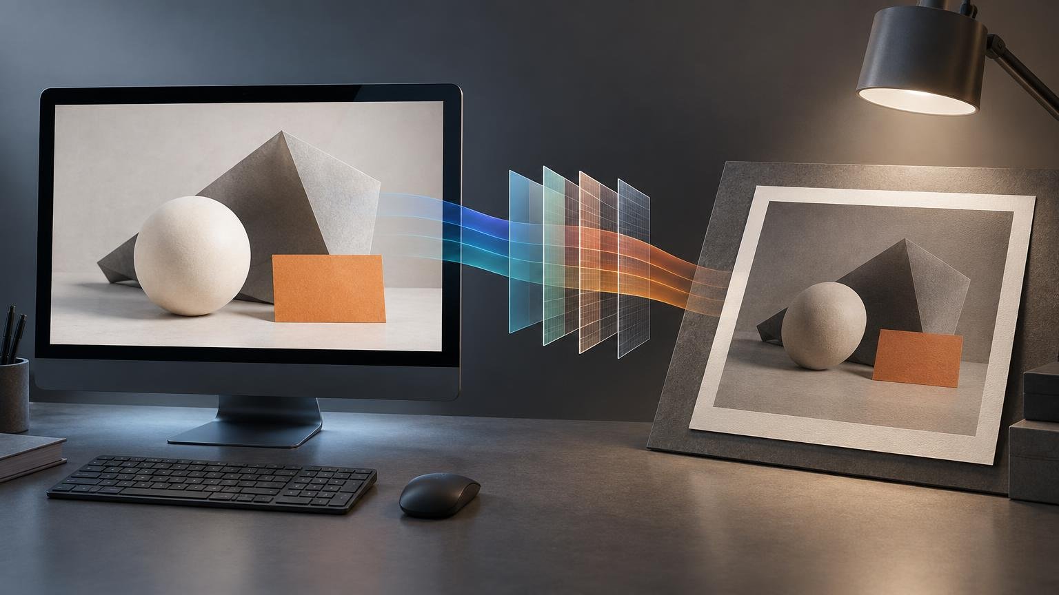
Editorial illustration of a desktop monitor displaying geometric shapes, colored translucent workflow panels between the screen and a framed print, and a desk lamp illuminating the print.

A darker print usually points to display brightness, profile handling, output limits, or viewing light—not a master file that simply needs brightening.
Categories Print Color

Color Proof vs Layout Proof: What Can You Actually Approve From Each?

September 28, 2026 by Unified Color
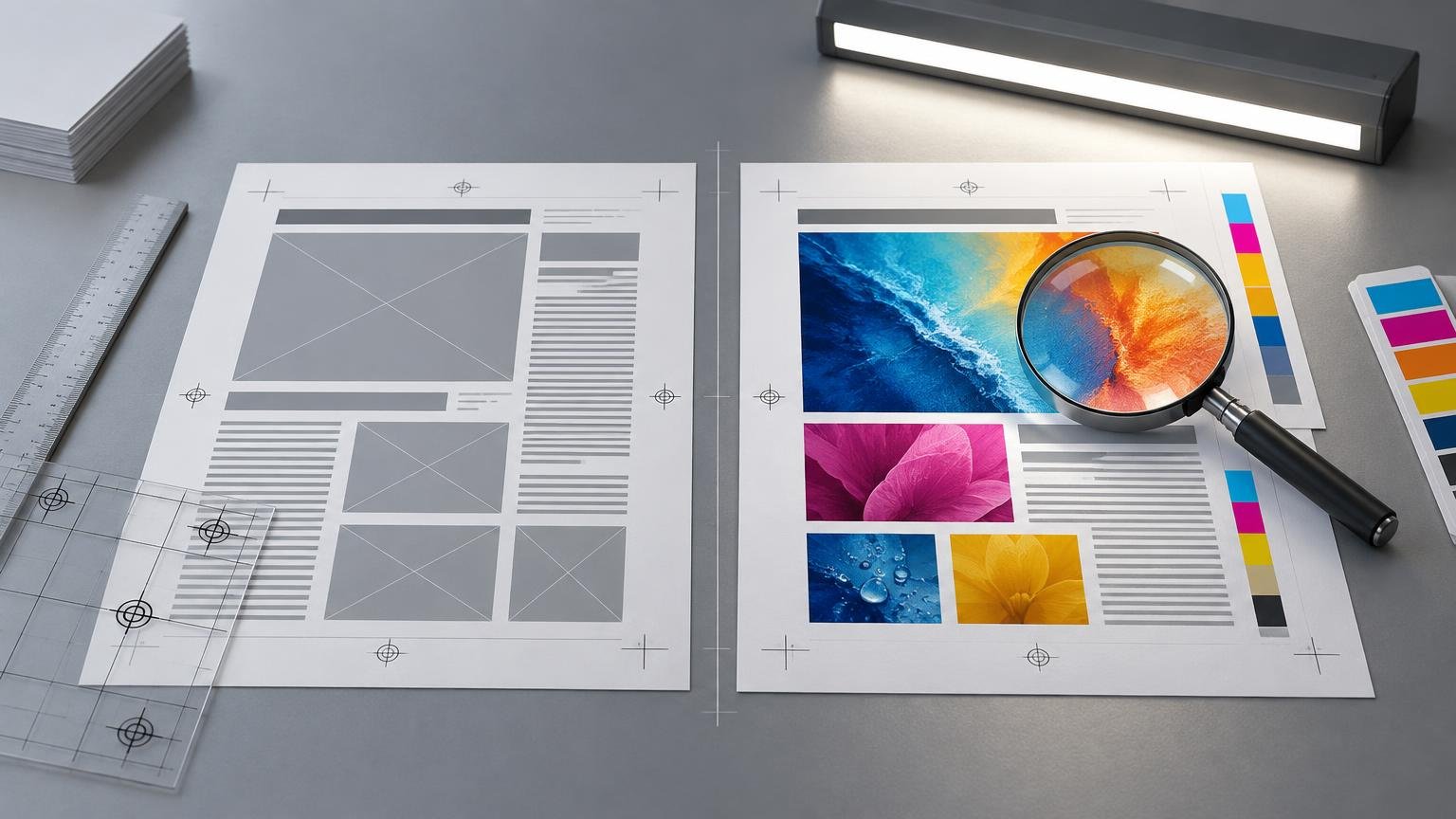
Side-by-side printing proofs on a gray work surface: a grayscale layout sheet with image placeholders and text lines beside a full-color sheet with photos, color bars, crop marks, and a magnifying glass. A ruler, transparent grid sheets, paper stack, and desk light surround them.

A layout proof confirms content and placement. A color proof can support color approval only when its profile, output condition, production controls, and limits are defined.

Categories Workflow & Proofing
Older posts
Page1 Page2 Next →
Unified Color Theory and Print

Explore

  • About Us
  • Blog
  • Contact
  • Editorial Policy
  • Home
  • Privacy Policy

Topics

  • Calibration & Displays
  • Color Spaces & Profiles
  • Print Color
  • Workflow & Proofing
© 2026 Unified Color Theory and Print

Information

  • Privacy Policy