How Bright Should Your Monitor Be for Reliable Print Matching?

TLDR

If you are asking how bright should your monitor be for reliable print matching, start at 120 cd/m², also called 120 nits. Calibrate and profile the display at that target, make a color-managed test print, and judge it under the light in which the finished print will normally be seen. If properly managed prints repeatedly appear darker than the screen, recalibrate at 100, 90, or 80 cd/m² rather than brightening every image file to compensate. X-Rite recommends this progression from a 120 cd/m² starting point.

The central rule is simple: monitor luminance should agree with print-viewing illumination. There is no universally correct brightness because a print judged under strong controlled lighting can support a brighter display than one viewed in a dim room. For most photography and general print work, 120 cd/m² is a practical baseline; 80–100 cd/m² is often more suitable when the intended viewing environment is subdued.

How bright should your monitor be for reliable print matching?

Working situation Useful starting target What to do next
General photography and print preparation 120 cd/m² Calibrate, print a known image, and compare it under the intended viewing light.
Prints consistently look too dark 80–100 cd/m² Lower the calibration target in steps and create a new display profile each time.
Controlled graphic-arts soft proofing A defined standard may call for 160 cd/m² Follow the complete proofing specification, including viewing illumination, rather than adopting the number alone.

Treat these values as calibrated luminance targets, not monitor-menu percentages. A setting of 50 percent on one display may produce a very different luminance from 50 percent on another. Panel age, backlight design, contrast settings, room light, and the display’s power-saving behavior can all affect the result. A colorimeter measures the actual output and lets the calibration software aim for a defined cd/m² value.

A lower print-oriented target is not unusual. EIZO’s EasyPIX photo and print matching preset, for example, specifies 80 cd/m² with a 5500 K white point and gamma 2.2. That does not make 80 cd/m² universally correct, but it demonstrates why a subdued target can be appropriate when screen and paper are evaluated as a matched system.

Why an overly bright screen produces dark prints

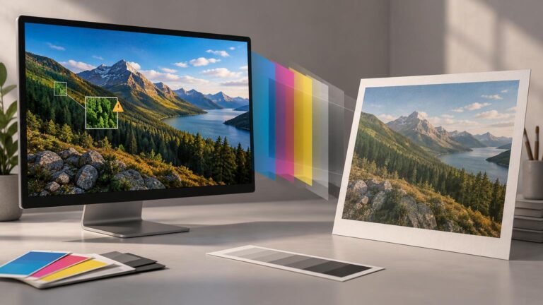
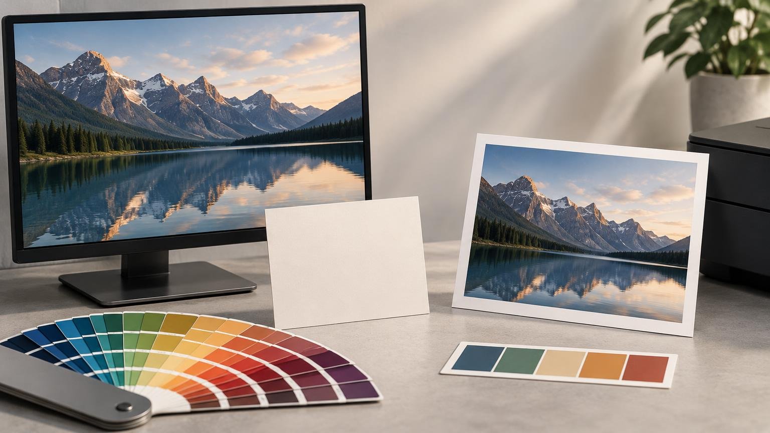
A bright screen makes shadow detail and midtones appear more open than they will on reflective paper. You may then darken the image during editing because it looks too light on screen. The printer reproduces those darker file values, and the resulting print appears disappointingly dark under ordinary room light.

The wrong fix is to brighten each file until one print happens to look acceptable while leaving the display unchanged. That correction becomes baked into the image and may cause problems with another printer, paper, lab, or display. The better fix is to lower the monitor’s calibrated luminance until your editing decisions become dependable across multiple test images.

One dark print does not prove that monitor luminance is wrong. First exclude an unsuitable printer profile, incorrect application settings, double color management, a dim print-viewing area, or a paper whose white and black points differ substantially from the display preview. Adjust luminance when the tonal mismatch is repeatable across several correctly managed prints.

Match the display to the print-viewing light

A display emits light; paper reflects the light that falls on it. Consequently, the same print can appear brighter, darker, warmer, or cooler when moved between daylight, a viewing booth, office lighting, and warm household lamps. A screen cannot provide stable guidance if the illumination around it changes throughout the day.

The International Color Consortium notes that changing room illumination, including daylight variation, can undermine calibration accuracy. Its graphic-arts guidance describes D50 illumination at 500 lux as a practical print-appraisal reference and identifies D50 capability and 160 cd/m² for displays used in a specified soft-proofing context. ICC display calibration guidance

That 160 cd/m² figure should not replace 120 cd/m² as a generic recommendation. It belongs to a controlled graphic-arts workflow with defined print illumination and surrounding conditions. Raising a home editing display to 160 cd/m² while judging prints in a dim room is likely to increase, not solve, the visual mismatch.

D50 and D65 are white-point descriptions, not brightness settings. You can calibrate two displays to the same luminance while giving them different white points. Choose white point according to the viewing setup and workflow requirements; choose luminance according to the brightness relationship between the screen and the illuminated print.

Brightness alone cannot create a reliable match

Monitor luminance controls only one part of the chain. Reliable print decisions also require a current monitor profile, an identified document profile, the correct printer-and-paper profile, color-managed software, and a stable viewing environment. Adobe describes the monitor profile as fundamental to dependable color decisions and recommends instrument-based calibration and profiling for the best accuracy.

Keep the roles of profiles and color spaces distinct. An image may be encoded in sRGB, Adobe RGB, or another working space, but that does not tell the application how a particular monitor or printer behaves. The monitor profile characterizes the display. The output profile describes a printer, ink, and paper combination or another destination process. If the distinction is unclear, this comparison of sRGB, Adobe RGB, and Display P3 explains where working color spaces fit into a print workflow.

For printing, use the exact output profile supplied for the destination process whenever possible. A generic profile for the printer model may not accurately represent a different paper, ink set, driver mode, or commercial press condition. Adobe notes that soft-proof accuracy depends on the display, monitor and output profiles, and ambient lighting; a profile specific to the destination printer and paper is often the most accurate choice.

A repeatable screen-to-print matching workflow

  1. Stabilize the room light. Avoid direct light on the display and large day-to-night changes while making critical adjustments.
  2. Set a target of 120 cd/m² in the calibration software. Use a colorimeter to calibrate and profile the display rather than estimating luminance by eye.
  3. Allow the operating system and color-managed application to use the newly created monitor profile. Do not assign that monitor profile to the image file.
  4. Confirm the image has an appropriate embedded document profile. Preserve or deliberately convert the color numbers through a managed workflow instead of discarding the profile.
  5. Obtain the correct output ICC profile for the exact printer, ink, and paper combination, or request the appropriate profile and instructions from the lab or print provider.
  6. Enable soft proofing with that output profile. Where the profile and application support it, preview paper color and black ink to see a more realistic reduction in contrast. Adobe documents these simulations as part of Photoshop’s proofing workflow.
  7. Print a familiar test image without introducing color management twice. Either the application or printer driver should perform the intended conversion—not both independently.
  8. Evaluate the print under its intended viewing light. Compare overall tonal relationships, neutral balance, shadow separation, highlight detail, and important colors rather than expecting the paper to glow like the screen.
  9. If several prints are consistently darker than the display, recalibrate to 100 cd/m². Repeat at 90 or 80 cd/m² if needed, creating a fresh monitor profile after every change.

Do not change luminance and image tone at the same time. Changing one variable per test makes the result interpretable. Once the display target is settled, use image-specific proof adjustments only for limitations of the chosen output process.

Troubleshoot the type of mismatch you actually have

The print is consistently too dark

Check the print under adequate intended light, then confirm that the correct output profile and color-management settings were used. If the mismatch persists across several images, reduce calibrated display luminance in measured steps. This is the clearest sign that the screen is too bright relative to the print-viewing environment.

The print is too warm or too cool

Luminance is unlikely to be the whole answer. Compare the display white point with the print-viewing light and check whether nearby colored walls, lamps, or daylight are affecting adaptation. Also verify the monitor and output profiles. Reducing brightness may change the visual relationship, but it will not correct a fundamentally unsuitable illuminant or profile.

Some saturated colors change dramatically

This is often an output-gamut issue rather than a brightness problem. Paper and ink cannot reproduce every color visible on a modern display. Use the destination profile to soft proof the image, inspect the affected colors, and decide whether to reduce saturation, alter hue, or change the rendering approach. A wider-gamut working space preserves available color information, but it cannot make the printer reproduce colors outside its gamut.

The preview still looks more vivid than the print

A display can produce luminous highlights and deep blacks in the same image. Paper white is limited by the viewing light, while the darkest printable black still reflects some light. Paper surface and ink behavior further reduce or reshape contrast. Soft proofing can preview part of this difference, but literal screen-to-paper identity is not a realistic target.

The practical target is dependable judgment

Start at 120 cd/m². If properly profiled output repeatedly looks too dark under its intended viewing light, move down through 100, 90, and 80 cd/m², recalibrating and profiling at each step. Use 160 cd/m² only when a defined, controlled proofing specification calls for it and the print-viewing conditions support it.

The right setting is the one that lets you make tonal and color decisions without repeatedly compensating for the monitor. Stabilize the room, measure the display, use the correct printer-and-paper profile, soft proof, and compare a real test print under known light. That complete loop—not a brightness number in isolation—is what makes print matching reliable.

References

  1. Poor Results With ColorMunki Display On Mac
  2. EIZO EasyPIX Color Matching Tool | EIZO
  3. Display calibration — International Color Consortium
  4. Introduction to the ICC profile format — International Color Consortium
  5. Color-managing documents when printing in Photoshop | Photoshop
  6. Color profiles in Photoshop | Photoshop
  7. Proofing colors in Photoshop | Photoshop

sRGB vs Adobe RGB vs Display P3: Which Color Space Should You Use?

TLDR: In the sRGB vs Adobe RGB vs Display P3 decision, choose the space that fits the destination—not simply the one described as wider. Use sRGB for images intended for broad, unpredictable online viewing. Use Display P3 when delivering to a known wide-gamut, color-managed screen environment. Adobe RGB remains useful in some print-oriented workflows, but neither Adobe RGB nor Display P3 is a universal printing space. For print, the decisive reference is the ICC profile for the actual printer, ink, paper, and process.

The practical answer to sRGB vs Adobe RGB vs Display P3 starts with one question: where must the image look right? Color spaces describe how RGB values correspond to colors. They do not guarantee that every monitor or printer can reproduce those colors. Predictable results come from keeping the file correctly tagged, viewing it through a color-managed system, and proofing for the intended output.

The quick decision

Destination Best starting choice Why What to check
General websites, email, and unknown screens sRGB It is the safest common delivery space when you cannot control the viewer’s display or software. Convert to sRGB and embed the profile.
Wide-gamut apps and modern screen-first work Display P3 It can preserve more saturated screen colors than sRGB when the complete viewing path supports color management. Use a wide-gamut display and test an sRGB fallback if necessary.
Print production Keep a tagged working file; proof to the output ICC profile The printer, paper, ink, and process determine the reproducible output gamut. Obtain the provider’s current file requirements and exact output profile.
Mixed web and print use Create separate output versions A single delivery file rarely serves every destination optimally. Preserve a tagged master, then convert copies for each output.

Adobe recommends sRGB for documents intended exclusively for online viewing and advises embedding a profile so color-managed applications can interpret the file correctly. That does not mean sRGB is technically superior in every respect. It means sRGB is usually the lower-risk choice when the viewing environment is unknown.

How sRGB, Adobe RGB, and Display P3 actually differ

sRGB: the compatibility-first choice

sRGB is the default delivery choice for broad web use, ordinary online portfolios, email attachments, and files that will pass through unpredictable software. Its principal benefit is not that every device reproduces it perfectly. Rather, it reduces the chance that a wide-gamut file will be mishandled or displayed without the intended interpretation.

Choose sRGB when consistency across many unknown systems matters more than retaining every highly saturated color in the source. This is especially sensible for client previews, online stores, social delivery, and general-purpose JPEG exports. Keep the profile embedded; an untagged file forces software to guess what its RGB numbers mean.

Adobe RGB (1998): a print-oriented working and interchange option

Adobe RGB (1998) is a separate RGB color encoding, not a printer profile. Adobe describes it as useful in print-oriented work because it includes certain cyan and blue colors outside sRGB. That can be useful when the source image and intended output contain colors that would be constrained by an early conversion to sRGB.

The important qualification is “can be useful.” An Adobe RGB file does not automatically produce a better print. The printer may reproduce only part of its gamut, and the result still depends on the specific paper, ink, device, rendering choices, and production process. Adobe RGB is therefore a possible working or delivery space—not a substitute for proofing against the output condition.

Display P3: designed for wide-color screen presentation

Display P3 uses P3 primaries with a D65 white point and the sRGB transfer function. Apple describes it as capable of representing more saturated colors than sRGB. It is well suited to screen-first work when the target platform, application, and display all support a color-managed wide-gamut path.

Display P3 should not be confused with cinema-oriented DCI-P3. They share P3 primaries, but their white-point and transfer-function definitions differ. Selecting a generic “P3” option without checking which definition is in use can introduce an avoidable mismatch.

A wide-gamut display is also important when making fine judgments about P3 colors. On an sRGB-class display, color management may map the image for viewing, but colors outside the display’s gamut cannot be shown distinctly and may appear clipped or merged. You can edit the file, but you cannot reliably judge color differences the monitor cannot reproduce.

Do not rank the three spaces as simply small, medium, and large

It is tempting to arrange sRGB, Adobe RGB, and Display P3 on one ladder and select the “largest.” That shortcut hides the real decision. Adobe RGB and Display P3 extend beyond sRGB in different regions, so one is not universally more useful for every photograph, illustration, screen, or printer.

A larger encoding space can preserve colors that a smaller one cannot represent, but it also creates additional dependencies. The display must reproduce enough of the gamut for meaningful editing, the application must honor profiles, and the destination must be defined. If any part of that chain fails, choosing a wider space can increase uncertainty rather than improve visible color.

Bit depth is a separate consideration. A wider color space spreads channel values across a wider range of colors, while bit depth determines how many tonal code values are available. Neither term describes HDR by itself, and neither guarantees a wider printer gamut.

Why identical RGB numbers can produce different colors

An RGB triplet such as 40, 180, 90 is not a complete color description. Its appearance depends on the color space used to interpret those values. The embedded ICC profile supplies that interpretation, while the monitor profile describes how the display behaves. An output profile performs the corresponding role for a printer and its output condition.

The ICC color-encoding registry lists sRGB and Adobe RGB (1998) as separate output-referred encodings and provides distinct resources for Display P3. This separation matters because a document profile, a monitor profile, and a printer profile have different jobs. Adobe likewise distinguishes document, monitor, and output-device profiles, noting that paper and ink affect a printer’s output profile and reproducible gamut.

  • The document profile defines the meaning of the file’s RGB values.
  • The monitor profile helps the color-management system translate those colors for the display.
  • The output profile describes a particular printing condition, including the relevant device and materials.
  • The color-management system connects these descriptions and maps colors when exact reproduction is impossible.

The best color-space workflow for printing

For print, stop asking which general RGB space is always best and identify the actual output condition. A printer profile tied to the intended printer, ink, paper, and process is more relevant than a broad Adobe RGB-versus-P3 debate. Soft proofing uses that profile to simulate the output condition on screen. It is a forecast, not a physical proof or guarantee.

  1. Calibrate and profile the display under stable viewing conditions. Calibration sets the target behavior; profiling characterizes the resulting behavior.
  2. Preserve a tagged master file. Avoid discarding useful source color until the destination requires a conversion.
  3. Ask the print provider for its current file specifications. Confirm accepted color spaces, profile requirements, file format, and whether the provider expects RGB or CMYK.
  4. Obtain the correct ICC output profile for the exact printer, paper, ink, and process when one is available.
  5. Enable soft proofing with that profile. Inspect saturated colors, shadow separation, paper-white changes, and the effect of the selected rendering intent.
  6. Make output-specific adjustments on a proof copy rather than compromising the master file.
  7. If the delivery space must change, convert to the required profile and embed it. Do not merely assign a different profile.
  8. Ensure that color conversion is handled once by the intended stage of the workflow, rather than unknowingly applying competing conversions.

Some providers request sRGB, some accept wider RGB files, and others specify a particular CMYK condition. There is no responsible universal rule that every photographer should convert to CMYK before submission. Follow the provider’s current specification and preserve an editable RGB master so that output conversions can be recreated when the process changes.

Convert to profile and assign profile are not interchangeable

This distinction prevents many dramatic color errors. Assigning a profile changes the interpretation of the existing RGB numbers. Converting to a profile changes those numbers in an effort to preserve the current appearance within the target space.

Use assignment to correct a missing or incorrectly identified source profile only when you know what the RGB numbers were intended to mean. Use conversion when preparing a correctly interpreted image for a different color space. For example, converting an Adobe RGB master to sRGB is the appropriate operation for a general web copy. Assigning sRGB to the same Adobe RGB values would reinterpret the file and commonly produce a visible shift.

Common problems and the first thing to check

An Adobe RGB image looks dull or wrong online

First confirm that the file is tagged and that the export was converted—not assigned—to the intended delivery space. For broad online distribution, create an sRGB copy with its profile embedded. Also remember that websites or intermediate services may process uploaded files, so compare the exported file locally in a color-managed application before blaming the edit.

A Display P3 image looks ordinary on another screen

The second screen may have an sRGB-like gamut, or part of the viewing path may not manage color correctly. A P3 tag cannot make a display reproduce colors outside its physical capabilities. If the audience is mixed, prepare and inspect an sRGB version as the compatibility fallback.

The monitor and print do not agree

Check the chain in order: display calibration and profile, ambient light, embedded document profile, correct soft-proof profile, rendering choices, and the provider’s output condition. A P3-capable monitor alone cannot make print match automatically. The printer’s gamut, paper white, surface behavior, ink, and viewing illumination remain distinct variables.

The soft proof looks less vivid

That may be an honest prediction rather than a malfunction. A display can emit bright, saturated light that a reflective print cannot reproduce under the same visual conditions. Use the soft proof to decide which colors need selective adjustment, but do not force every clipped color toward maximum saturation. Protecting tonal relationships and important subject colors is often the more convincing result.

A practical choice for photographers and designers

If your work is almost entirely web-based and reaches unknown viewers, sRGB is the straightforward delivery choice. If you create for a controlled wide-gamut screen environment, Display P3 can retain screen colors that sRGB cannot encode. If you maintain a print-oriented workflow, Adobe RGB may be useful, but only when your software, display, output process, and collaborators handle it correctly.

You do not need one permanent choice for every file. A more resilient workflow keeps a high-quality, correctly tagged master and creates destination-specific copies. That approach avoids forcing a web constraint onto the print master or sending a wide-gamut file into an uncertain online environment.

Final checklist

  • Choose the delivery space for the destination, not for prestige.
  • Use sRGB for broad online compatibility.
  • Use Display P3 for a known, color-managed wide-gamut screen workflow.
  • Treat Adobe RGB as a useful option in suitable print-oriented workflows, not as a universal print setting.
  • Keep document, monitor, and printer profiles distinct.
  • Convert profiles to preserve appearance; assign only to correct interpretation.
  • Embed the delivery profile.
  • Soft-proof print work with the exact output profile when available.
  • Ask the print provider for current specifications before converting to CMYK or another requested space.
  • Keep a tagged master so you can make new output versions without compounding conversions.

Choose the destination first

The safest decision is not “always use the widest space.” It is to define where the color must survive. Deliver sRGB to unknown online viewers, use Display P3 when the screen pipeline is deliberately wide-gamut, and prepare print through the specific output profile rather than relying on Adobe RGB or P3 alone. Start by confirming the destination, then make one controlled conversion from a correctly tagged master.

References

  1. Color-managing documents for online viewing in Photoshop | Photoshop
  2. Embed color profiles in Photoshop | Photoshop
  3. Adobe Acrobat Color settings | Adobe Acrobat
  4. Adobe RGB (1998) | Three Component Color Encoding Registry
  5. Color | Apple Developer Documentation
  6. Color.RGBColorSpace.displayP3 | Apple Developer Documentation
  7. Three Component Color Encoding Registry
  8. Color-managing documents when printing in Photoshop | Photoshop