
Color Proof vs Layout Proof: What Can You Actually Approve From Each?
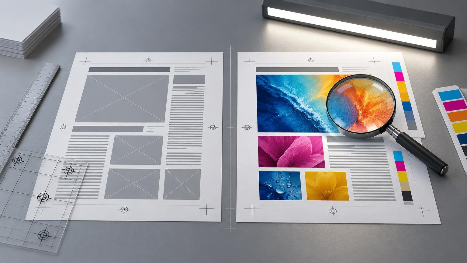
TLDR: For color proof vs layout proof what can you actually approve from each, use a layout proof to approve content, dimensions, page order, and element placement. Approve color only from a color-managed proof tied to a named output condition. A PDF or printed sheet does not become a reliable color proof merely because a supplier calls it one.

The practical boundary is simple: approve what the proof was designed and controlled to demonstrate. A layout proof answers “Is everything present and positioned correctly?” A color proof answers “How should these colors and tonal relationships reproduce under a particular printing condition?” For another print-buyer perspective on this distinction, see this comparison of color proofs and layout proofs.

Color proof vs layout proof: what can you actually approve from each?

Proof type Reasonable approvals What it does not establish by itself
Layout or online PDF proof Copy, prices, contact details, page order, orientation, image choice, crops, trim, bleed, safe area, folds, dielines, and placement of finish masks Final printed color, paper appearance, press variation, tactile finishes, reflectivity, or production quality
Color-managed soft proof Expected color and tone within the selected proof profile, including some out-of-gamut warnings and paper-color simulation where supported A physical match without a calibrated display, correct profile, controlled viewing conditions, and an agreed output target
Regular hard-copy color proof A physical indication of color and tone within the stated proofing process Contract-level accuracy unless the system, simulated condition, verification method, and tolerances are defined
Contract proof A controlled prediction of a specified printing condition and a reference for production discussions Effects outside the proofing system, such as foil, embossing, stock texture, raised coatings, binding, or every special ink
Physical sample or mock-up Selected aspects of size, stock, construction, folds, finishing, or handling, depending on how it was made Color accuracy unless it was also produced as a controlled color proof

These categories can overlap. A color-managed PDF may also show layout, while a contract proof necessarily contains the design. The important question is not whether the proof is digital or physical. It is which characteristics the supplier intends it to predict and how those characteristics are controlled.

What a layout proof lets you approve

Treat a layout proof as a final inspection of file content and geometry. Read every line as if the piece had already been delivered. Check names, dates, prices, phone numbers, URLs, legal text, captions, and version-specific details. For a multipage job, confirm the page count, sequence, blank pages, spreads, and orientation.

Then inspect the relationship between artwork and production boundaries. Verify crop choices, trim position, bleed extension, safe margins, folds, perforations, holes, and dielines. If the project uses foil, varnish, white ink, embossing, or another separate production layer, confirm that the mask is present, correctly named if required, and aligned with the intended artwork.

A layout proof can reveal that a photograph is the wrong version or that text is too close to a fold. It cannot tell you whether a saturated blue is printable, whether neutral gray will remain neutral, or whether shadow detail will survive the intended process. Even if the PDF looks attractive on screen, appearance alone is not permission to approve color.

Why an emailed PDF is not automatically a color proof

A PDF can serve as a soft proof, but only when it is viewed through a defined color-management setup. Adobe describes soft proofing as previewing expected output through a proof profile, commonly an output-device profile. The result depends on the monitor, monitor profile, output profile, and ambient viewing conditions. A profile made for the relevant printer-and-paper combination can provide a more specific preview than a generic setup. Adobe’s soft-proofing guidance explains these dependencies.

This is why final color should not normally be approved from a phone, an uncalibrated office display, a browser window with an uncertain color path, or a PDF viewed under unknown settings. Screen brightness also changes judgment: a very bright display can make shadows and midtones appear more open than they will on paper.

For a meaningful soft proof, establish all of the following:

  • A characterized and calibrated display in a stable state.
  • A current monitor profile used by the operating system and color-managed application.
  • The correct document profile or an accurately interpreted source color space.
  • A named output profile or printing condition supplied or approved by the printer.
  • Consistent soft-proof settings, including rendering intent and any black-ink or paper-color simulation options relevant to the review.
  • Controlled room lighting without strong glare or changing colored light.
  • An agreement about which visual characteristics the soft proof is expected to predict.

Keep color space and output profile distinct. An image tagged Adobe RGB, Display P3, or sRGB describes how its RGB values should be interpreted; it does not describe the press, ink, or paper that will produce the job. If that distinction is unclear, this guide to sRGB, Adobe RGB, and Display P3 explains the roles of common RGB working and delivery spaces.

What a hard-copy color proof establishes

A hard-copy proof moves the review onto a physical sheet, which removes some uncertainty associated with individual displays. That does not make every printed proof equally predictive. An office print, an unverified inkjet sample, a press-calibrated proof, and a measured contract proof represent different levels of control.

Before approving color from a hard copy, ask which printing condition it simulates. You need more than the printer model used to make the proof. Useful information includes the target characterization data or ICC profile, proofing system, substrate, verification status, measurement tolerance, and recommended viewing light. Without a named target, “color proof” may mean only that the sample is in color.

Paper is part of the visual result. Its white point, surface, absorbency, and gloss affect perceived color and contrast. A proof may simulate aspects of a target paper but still be printed on a different proofing stock. Ask whether paper color is simulated and whether the proof is intended to predict the chosen production stock or a standardized printing condition.

When a printed proof becomes a contract proof

A contract proof is a controlled production reference, not simply the most expensive printed sample. ISO 12647-7:2016 covers hard-copy digital proofing processes intended to simulate a printing condition defined by characterization data. That scope supports a clear distinction between a controlled proofing system and an arbitrary color print.

In practice, ask whether the proof is verified against the stated target and whether its measurement report or control strip accompanies it. Also confirm how the supplier uses the proof during production. The commercial or contractual significance of an approved proof depends on the terms agreed with that supplier; the word “contract” alone should not substitute for a written understanding of tolerances and responsibilities.

A controlled proof is most valuable when color materially affects acceptance: branded color, demanding skin tones, neutral product photography, subtle shadow detail, high-value packaging, large print runs, or jobs where a dispute would be costly. It creates a better reference for discussion than competing memories of what appeared on different screens.

Check overprints separately from ordinary color

Overprint behavior deserves a separate prepress check. A design can look correct when objects knock out yet change substantially when black text, spot colors, or special separations overprint underlying artwork. Adobe advises using overprint-preview functions when overprint behavior matters; ordinary soft proofing alone is not an adequate offset-overprint check, and output can still vary with RIP and printing settings.

Acrobat Pro’s Output Preview can help inspect separations, color spaces, spot colors, total ink coverage, page boxes, and individual objects. These are diagnostic checks, not guarantees of the manufactured result. Adobe’s Output Preview documentation describes the available inspection tools.

When reviewing a file with overprints or spot separations, confirm the intended inks appear on the correct plates and compare the preview with the supplier’s own prepress interpretation. If overprinting is essential to the design, record that requirement explicitly rather than assuming a visually correct screen preview will govern production.

What no ordinary color proof should be expected to predict

A conventional proof has a finite gamut and a particular imaging process. It may not reproduce fluorescent, metallic, pearlescent, transparent, opaque white, or unusually saturated spot inks accurately. A simulated spot color can be useful for placement and approximate relationships without being an exact prediction of the production ink.

The same limitation applies to effects driven by reflection, relief, texture, or construction. Do not use an ordinary PDF or color proof to approve the final appearance of foil, embossing, debossing, raised ink, glitter, gloss contrast, textured stock, lamination, cutting, folding, or binding. These may require a material swatch, finish sample, prototype, wet proof, drawdown, or press check, depending on the process and risk.

White ink deserves particular care because its appearance depends on opacity, number of passes, substrate color, and what is printed above or below it. A screen simulation can show where white ink is intended, but it cannot by itself establish the physical result.

Choose the proof according to the risk

Main risk Minimum useful review Consider upgrading to
Wrong content or placement Layout proof with careful copy and geometry review Physical mock-up for folds, cuts, or complex construction
Unexpected process color Color-managed soft proof using the correct output profile Controlled hard-copy proof when color is critical
High-value job or costly disagreement Named, documented proofing procedure Verified contract proof and written approval terms
Spot or special ink Separation check plus supplier guidance Ink drawdown or process-specific sample
Foil, texture, coating, or relief Mask-placement review Material sample, prototype, or press check
Overprint or ink-limit issue Output Preview and separation inspection Supplier preflight or RIP-based review

Use the least elaborate proof that controls the meaningful risk, not simply the cheapest proof offered. A one-color instruction sheet may need only a rigorous layout check. A cosmetics package with neutral photography, spot inks, foil, and a complex dieline may require several different approvals because no single proof can establish every characteristic.

Preserve a clear approval record

Approval is safer when everyone can identify exactly what was reviewed. Preserve the final file name and version, proof date, proof type, named output condition or profile, supplier annotations, your requested corrections, the corrected proof, the approver’s identity, and the relevant correspondence.

Avoid a bare message saying “approved” when only part of the proof is approved. A clearer response would separate the boundaries: “Layout, copy, page order, and dieline placement approved; color not approved from this PDF,” or “Color approved against the supplied verified proof for the stated printing condition; foil appearance remains subject to the approved material sample.” The wording should match the supplier’s process and your agreement.

Questions to ask before approving

  • Is this a layout proof, a color-managed soft proof, a hard-copy color proof, or a verified contract proof?
  • What characteristics is this proof intended to establish?
  • Which output profile, characterization data, or printing condition does it simulate?
  • If it is a hard-copy proof, has it been measured or verified against that target?
  • Which substrate is represented, and is paper color being simulated?
  • What display or viewing-light conditions should be used?
  • How should overprints and spot-color separations be reviewed?
  • Which inks, finishes, construction details, or press variations remain outside the proof’s scope?
  • What tolerance will production use when matching an approved color proof?
  • Which file version and written annotations become the approval record?

Approve the proof, not the assumption

The safest rule is to separate file approval, color approval, and physical-production approval. Use a layout proof for words, versions, geometry, and placement. Use a properly configured soft proof for an informed on-screen prediction. Request a controlled hard-copy or contract proof when color risk justifies a physical reference. Use samples or press checks for effects a color proof cannot reproduce.

Before signing off, ask one final question: “What does this specific proof establish?” If the answer does not name the proof type, output condition, controls, and exclusions clearly enough for the job’s risk, the next step is not approval. It is a better-defined proof.

References

  1. Color Proof vs Layout Proof: What Each Can Approve – The Print Reviewer
  2. Proofing colors in Photoshop | Photoshop
  3. ISO 12647-7:2016 – Graphic technology — Process control for the production of halftone colour separations, proof and production prints — Part 7: Proofing processes working directly from digital data
  4. Preview overprint in Acrobat Pro | Adobe Acrobat
  5. Previewing output (Adobe Acrobat Pro) | Adobe Acrobat