Skip to content
Unified Color Theory and Print
  • Blog
  • Privacy Policy
  • About Us
  • Contact
  • Editorial Policy
  • Home

Unified Color

How Bright Should Your Monitor Be for Reliable Print Matching?
September 24, 2026 by Unified Color
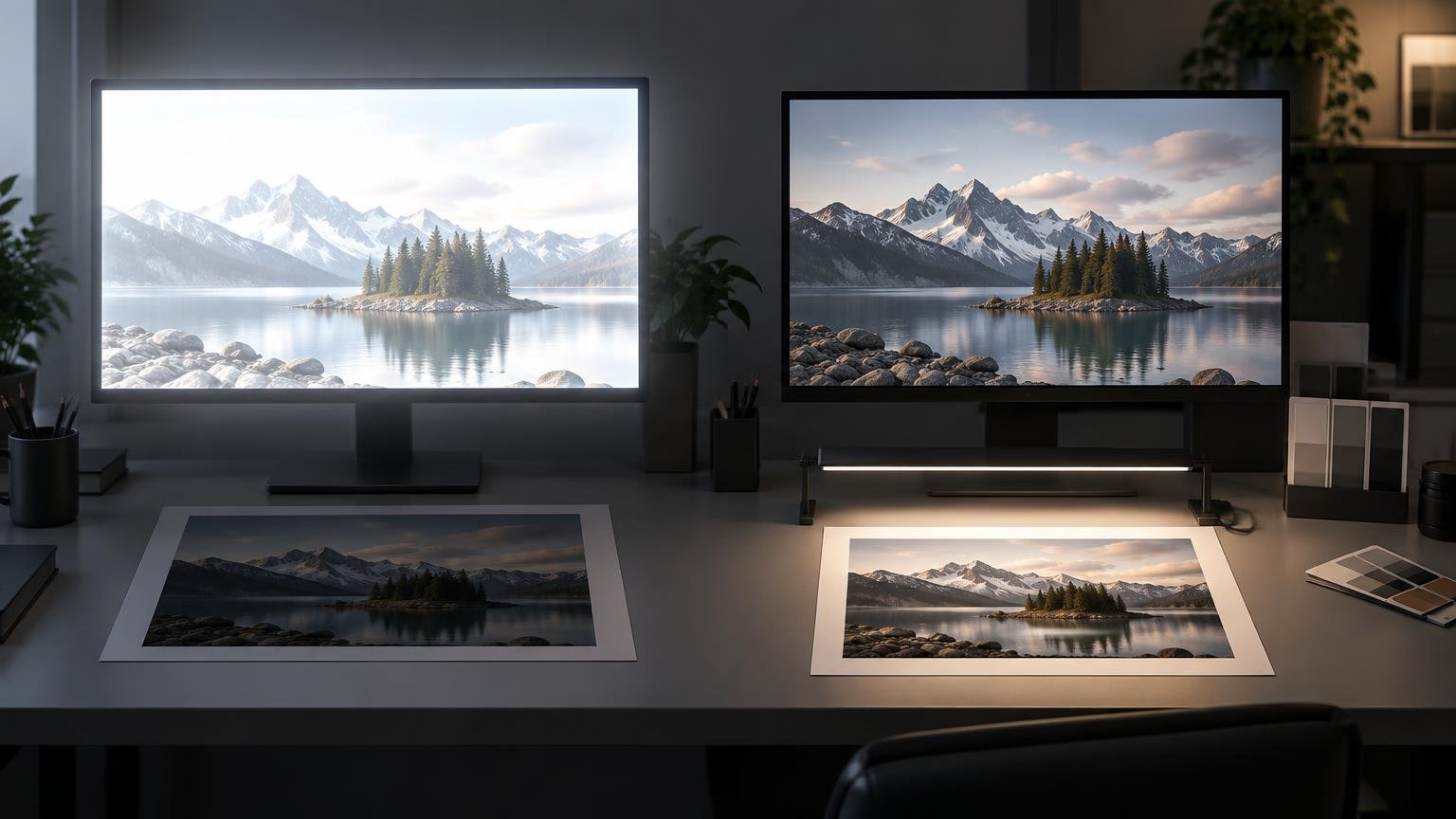
Wide editorial-style workspace showing two monitors with the same mountain-lake photograph above two paper prints; the left monitor is much brighter while the right-side print is illuminated by a desk light.

Start at 120 cd/m², evaluate a correctly managed print under its intended light, and lower the calibrated target if prints consistently look too dark.

Categories Calibration & Displays

sRGB vs Adobe RGB vs Display P3: Which Color Space Should You Use?

September 24, 2026 by Unified Color
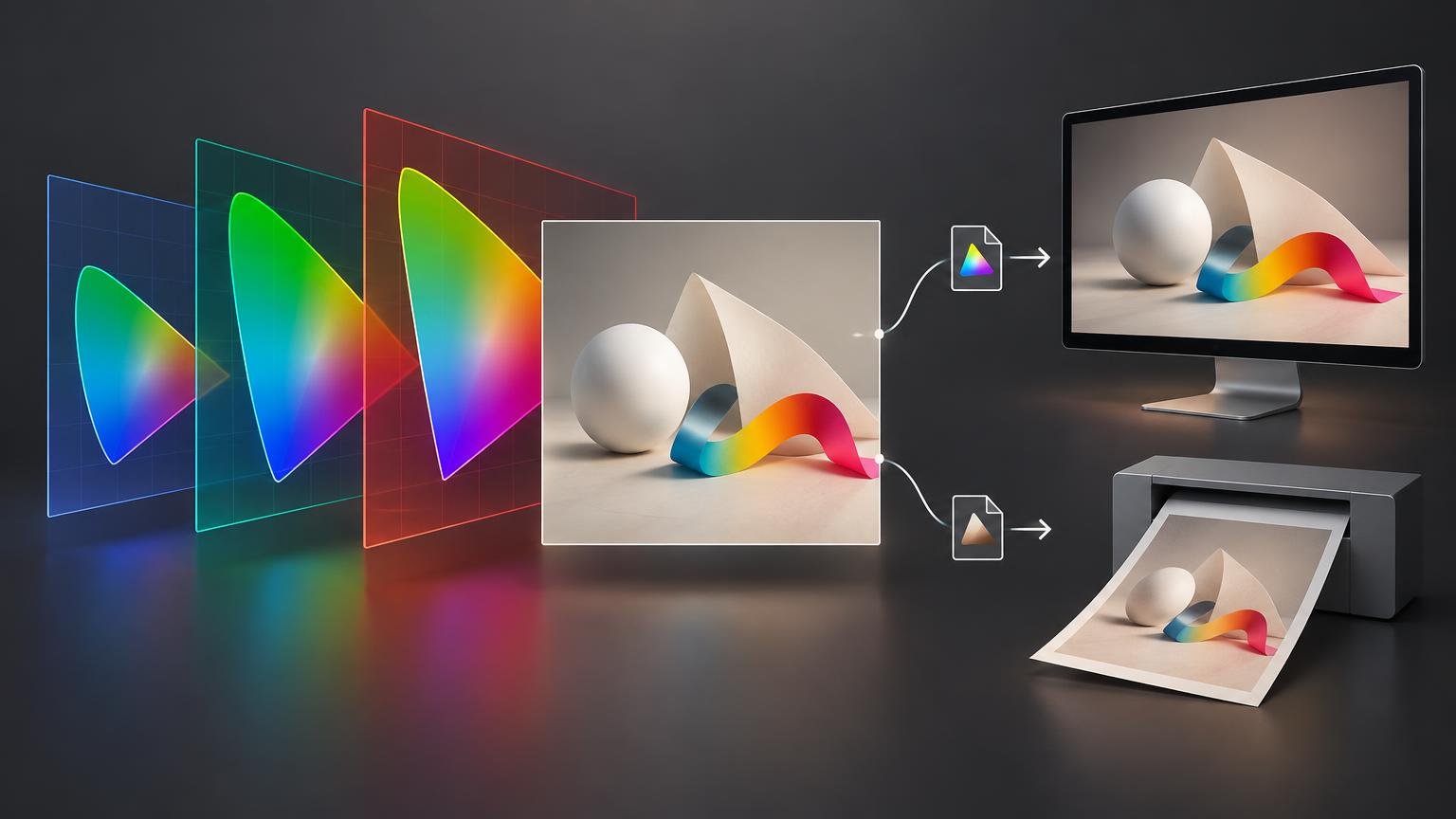
Editorial color-workflow illustration showing three overlapping rainbow-gamut panels leading to an artwork preview, with separate paths to a monitor and a desktop printer.

Choose sRGB for broad online compatibility, Display P3 for controlled wide-gamut screen work, and an output-profile workflow when preparing files for print.

Categories Color Spaces & Profiles
Newer posts
← Previous Page1 Page2
Unified Color Theory and Print

Explore

  • About Us
  • Blog
  • Contact
  • Editorial Policy
  • Home
  • Privacy Policy

Topics

  • Calibration & Displays
  • Color Spaces & Profiles
  • Print Color
  • Workflow & Proofing
© 2026 Unified Color Theory and Print

Information

  • Privacy Policy