
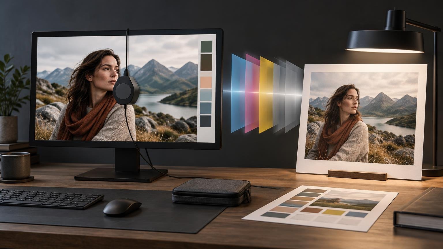
For photo and print work, calibrate with a hardware measurement device, create a monitor profile, and then evaluate prints under consistent lighting. A practical starting point is gamma 2.2, luminance around 100–120 cd/m², and a white point chosen for your print-viewing environment. Those are starting conditions, not universal values: the best target is the one that produces a repeatable visual relationship between your screen and correctly managed prints.
Calibration alone does not make a monitor match a printer. The screen emits light, while a print reflects it. Paper white, ink, surface texture, output gamut, and viewing illumination all affect the result. The goal is not an impossible pixel-for-pixel match; it is a predictable preview that helps you make better editing and printing decisions.
Understand calibration and profiling first
Calibration sets the display to a defined state, including its luminance, tone response, and white point. Profiling measures the calibrated display and creates an ICC profile describing how that particular screen reproduces color. Color-managed applications use the profile to correct the appearance of tagged image colors on that display. The International Color Consortium’s display calibration guidance explains this distinction in more detail.
The monitor profile is not an image working space and it is not a printer profile. Your document profile defines what the image’s RGB or CMYK numbers mean, the monitor profile supports the on-screen preview, and the printer/paper profile describes a specific output condition. Substituting one for another breaks the color-management chain.
Prepare the display and editing room
Let the monitor warm up before measuring it. Adobe recommends at least 30 minutes, while ICC guidance cites about 15 minutes; the appropriate interval depends on the display. Using 30 minutes is a sensible routine for color-critical work because it covers both recommendations without complicating the process.
Keep the room illumination stable and prevent direct sunlight or strong reflections from reaching the screen. Avoid strongly colored light and distracting colored surfaces near the display. A monitor hood can help when incident light is difficult to control.
Turn off any feature that changes the display automatically. That includes automatic brightness, ambient-light adaptation, HDR modes not required by the workflow, True Tone, Night Shift, and Windows Night Light. True Tone changes color temperature in response to ambient conditions, while Night Shift and Night Light warm the display. A screen that changes during editing no longer behaves like the condition measured by its profile.
Use a hardware measurement device
For color-critical editing, use a supported colorimeter or spectrophotometer rather than relying on visual calibration patterns. A measurement device reads the display’s actual output and is more accurate than adjustments made by eye. Adobe’s monitor calibration and profiling instructions recommend hardware measurement for professional color work.
Install the device software, place the instrument against the display as directed, and select the monitor technology if the software requests it. An incorrect backlight or display-type selection can affect the measurement. Allow the software to adjust the display automatically when the monitor supports hardware calibration; otherwise, follow its prompts for brightness and other available controls.
Choose targets that fit print viewing
| Setting | Practical starting point | What should change it |
|---|---|---|
| Tone response | Gamma 2.2 | Use another value only when a defined workflow requires it. |
| Luminance | About 100–120 cd/m² | Lower it if managed prints consistently look too dark beside the display; consider both room and print-viewing light. |
| White point | Match the intended viewing condition | Do not force a preset simply because it is common; paper and viewing illumination affect the useful target. |
| Profile type | Software-recommended ICC profile | Use the type supported reliably by the operating system, applications, and calibration package. |
ICC examples demonstrate why one target cannot suit every room. Its guidance includes D50 at 160 cd/m² for an ISO 3664-oriented graphic-arts condition, while cited EIZO examples include 5000 K at 80 cd/m² for printing and 5500 K at 100 cd/m² for photography. These are workflow examples, not proof that every photographer should copy the same numbers.
If your prints repeatedly appear darker than the screen, do not immediately brighten every file. The display may simply be too bright relative to the light used to inspect the print. Start by reviewing monitor brightness for reliable print matching, then recalibrate to a lower luminance if the comparison remains consistent.
Create and preserve the monitor profile
Run the measurement sequence, save the resulting ICC profile with a descriptive name and date, and let the calibration software install it as the active profile. Restart color-managed applications if necessary so they recognize the new profile.
Do not change brightness, contrast, color temperature, picture mode, or RGB controls afterward. Those changes alter the display behavior described by the profile. If you make a material adjustment, calibrate and profile again.
Recalibrate periodically because displays drift. Published guidance ranges from monthly for demanding color work to roughly every six months, depending on the monitor and required accuracy. A monthly schedule is reasonable for frequent professional output; less demanding work can use a longer interval if profile verification remains within tolerance. Recalibrate immediately after changing the display setup or room lighting.
Connect the calibrated display to the print workflow
Use the actual printer-and-paper ICC profile to soft proof the image. Photoshop can simulate output-gamut limits and paper white, so the proof may appear flatter or less vivid than the normal display view. That is useful information, not a calibration failure. See how soft proofing previews print color before you order or print. Adobe’s print color-management guidance also covers proof setup and rendering intents.
Make sure the selected printer profile, paper, media setting, ink set, and production process correspond. When the application manages color using the output profile, disable the printer driver’s competing color correction. If the driver manages color, do not ask the application to perform a second conversion. Double color management can introduce unwanted color and tone shifts.
Rendering intent is a separate output choice. Perceptual is often useful for photographs containing many out-of-gamut colors, while Relative Colorimetric can preserve closer matches for colors already inside the output gamut. Compare the available intents in soft proof view rather than assuming one is always better.
Evaluate a physical print correctly
Judge the finished print under stable illumination appropriate to where it will be displayed or approved. Moving a print between daylight, warm household lamps, and controlled proofing light can change its apparent color even though the file and ink remain unchanged.
Compare a known, correctly managed print with the soft proof at a comfortable viewing distance. If prints are consistently too dark, first check display luminance and viewing light. If only particular saturated colors differ, investigate the printer gamut and soft-proof warnings. If the whole print has a color cast, verify the output profile, media setting, driver color controls, and viewing illumination before editing the master image. The troubleshooting steps in why prints look darker than the screen help separate these causes.
Build a repeatable calibration routine
The reliable sequence is simple: stabilize the room, warm the display, disable adaptive features, measure with hardware, create the monitor profile, and leave the calibrated controls alone. Then soft proof with the correct printer/paper profile and inspect the output under consistent light.
Treat the first calibration as a measured starting point. If several correctly managed prints reveal the same screen-to-print bias, adjust the calibration target rather than compensating destructively in every image. A repeatable relationship between display and print is the useful result—and the foundation of dependable color decisions.
References
- Display calibration — International Color Consortium
- Calibrate and profile monitor in Photoshop on desktop | Photoshop
- Print with color management in Photoshop | Photoshop
- Set up your display for a specific workflow on Mac – Apple Support
- Change display brightness and color in Windows | Microsoft Support
- Using Adobe Photoshop CS3 Color Management | Epson US
- Workspace setup for color printing in Photoshop | Photoshop
- ColorNavigator 7 Photo Printing Instructions