
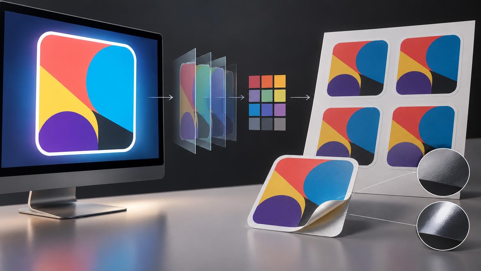
TLDR: The simplest explanation for why sticker colors can look different on screen and in print is that a display emits light while a printed sticker reflects ambient light. Differences in device gamut, color profiles, monitor settings, ink, white vinyl, surface finish, and viewing conditions add further variation. For a more predictable result, use color-managed software, preserve the artwork’s profile, work on a calibrated and profiled display, soft-proof with the correct output profile when one is available, and inspect a representative physical sample when color is critical.
A luminous green, deep blue, or bright orange may look vivid on a monitor but quieter, darker, or slightly shifted on a sticker. This does not necessarily mean the artwork or printing is defective. The screen and sticker are different color-producing systems, and the goal is not to make them physically identical. It is to manage the conversion and viewing conditions well enough that the printed result is a controlled, acceptable interpretation of the design.
Why sticker colors can look different on screen and in print
A screen creates color by emitting red, green, and blue light. A sticker is illuminated by its surroundings and sends a portion of that light back to your eyes. The print’s appearance therefore changes with daylight, warm household lamps, cool office lighting, shadows, and reflections in ways that do not affect a self-lit screen in the same manner. The viewing environment is part of the color result, not an afterthought.
Screen brightness can widen the apparent gap. If a display is set much brighter than the light falling on the sticker, shadows and saturated colors may appear more open and luminous on screen. The resulting print can then seem unexpectedly dark even if the file conversion was reasonable. If that is the main problem, use the more focused guide to why a print looks darker than its screen preview.
Four factors account for most avoidable surprises:
- Emitted versus reflected light: a bright display and a reflective sticker cannot produce the same visual stimulus under every condition.
- Different gamuts: the monitor may display colors the selected printer, ink, and material combination cannot reproduce.
- Profile handling: untagged, discarded, assumed, or incorrectly converted profiles can change what the color numbers mean.
- Physical output conditions: substrate color, transparency treatment, ink behavior, lamination, texture, and viewing light influence the final appearance.
RGB versus CMYK is only part of the answer
It is common to blame every shift on “RGB versus CMYK.” That shorthand identifies a real distinction, but it is incomplete. RGB and CMYK are color models, not single fixed sets of visible colors. An RGB value only has a dependable color meaning when it is associated with a defined color space or device profile. The same principle applies to CMYK values.
The gamut of a display is device- and profile-specific. One monitor may reproduce a highly saturated color that another monitor cannot, even when both receive the same RGB numbers. A printer has its own output gamut determined by the complete printing condition, including inks and material. The International Color Consortium’s display-gamut explanation provides useful background on why “RGB gamut” is not one universal boundary.
Converting a file to CMYK does not automatically make it print accurately. An arbitrary CMYK conversion can commit the artwork to the wrong output assumptions and may discard colors unnecessarily. If a printer accepts RGB artwork and performs the final conversion for its own production condition, preserving an appropriate embedded RGB profile may be the better handoff. Follow the printer’s current artwork specification rather than applying a generic conversion recipe.
This is also why a hex code is not a promise of printed appearance. Hex notation describes RGB channel values, usually in a digital context. It does not specify a printer, ink set, substrate, finish, illumination, or acceptable production tolerance.
Gamut and profiles solve different parts of the problem
Gamut is the range an output can reproduce
Gamut describes the range of colors available to a device or output condition. When artwork contains a color outside the sticker process’s gamut, that color must be mapped to something printable. Depending on the profile and rendering settings, the replacement may be less saturated, slightly different in hue, or altered in lightness.
Very intense screen colors are common candidates for visible changes, but the exact boundary cannot be predicted from a color name alone. It depends on the actual display and printing condition. Fluorescent-looking artwork is particularly risky when the production process uses conventional inks rather than special fluorescent colorants.
An ICC profile gives color numbers context
An ICC profile characterizes how a device or standardized color space relates its numerical values to defined colors. It lets color-managed software interpret a file’s RGB or CMYK values and translate them for another device. Adobe notes that profiles give document color values their color-space meaning and that an appropriate output profile is necessary for a useful print preview.
Assigning a profile and converting to a profile are not interchangeable. Assigning changes the interpretation of existing numbers. Converting changes the numbers to preserve appearance as closely as the destination allows. Assigning a new profile merely because an image looks wrong can create a larger mismatch.
Calibration and profiling are related but distinct
Calibration adjusts a display toward chosen operating targets. Profiling measures and describes its resulting behavior so color-managed applications know how to communicate color to it. The ICC recommends periodic recalibration because display behavior changes over time. ICC guidance on display calibration explains this relationship in more detail.
Calibration improves the reliability of the screen reference; it does not enlarge the printer’s gamut or guarantee an exact physical match. Bit depth is separate as well. Greater bit depth can provide finer tonal precision during editing, but it does not by itself calibrate a monitor, attach the correct profile, or make an unprintable color printable.
Material, white ink assumptions, and finish matter
Artwork does not float independently of its substrate. A white vinyl base supplies the reflective white underneath the printed inks. On clear or colored material, unprinted areas and partially transparent colors can behave differently because the background becomes part of the appearance. Never assume that transparent pixels will remain physically transparent without checking the selected product and its artwork rules.
For example, the standard custom vinyl product information supplied by CustomStickers.com states that it uses white vinyl and that transparent areas in the submitted file appear as white material for that product. It also says RGB or CMYK artwork can be supplied. Readers comparing custom vinyl stickers should check the current material and artwork details for their chosen product before treating transparency as a cutout, clear region, or printed white layer.
Surface finish changes perception too. Glossy surfaces can produce strong reflections and often preserve a different sense of depth or saturation than diffuse matte surfaces. Matte finishes reduce sharp glare but scatter light differently. If the sticker will be laminated, approve color on the finished construction rather than an unfinished print. See the comparison of how matte and gloss lamination change perceived color for the practical tradeoffs.
A practical preflight workflow for sticker color
Use this workflow before submitting an order. It cannot eliminate the physical differences between a display and print, but it can remove many preventable sources of uncertainty.
- Edit in color-managed software. Confirm that the application reads embedded profiles and that its color-management policies are appropriate for the files you open.
- Keep the intended source profile attached. Do not discard it or assign a different profile simply to change the preview. If artwork arrives untagged, identify its actual intended space before making a consequential conversion.
- Calibrate and profile the display. Choose targets appropriate to the room and print-viewing conditions, then recalibrate periodically. Avoid judging print color on an excessively bright screen.
- Stabilize the viewing environment. Reduce colored light on the monitor, avoid strong glare, and compare the sticker under lighting representative of where it will be used.
- Ask for the actual output profile and preparation instructions. If the printer supplies a profile for the relevant printer, ink, material, and finish, use that exact profile for soft proofing. Do not substitute an unrelated generic CMYK profile.
- Soft-proof the artwork. Enable the intended output profile and inspect how saturated colors, shadows, neutrals, and gradients change. Compare rendering intents where the workflow permits, and use gamut warnings as diagnostic aids rather than automatic correction commands.
- Check the physical specification. Confirm whether the substrate is white, clear, metallic, or colored; how transparent artwork areas are treated; and whether lamination or another finish will be applied.
- Order a representative sample or appropriate physical proof when the cost of a color error is high. Evaluate it under the intended light and on the final material and finish whenever possible.
What soft proofing can and cannot tell you
Soft proofing uses an output profile to simulate a target printing condition on a monitor. In supported software, settings may include the output-device profile, rendering intent, and black-point compensation. Its value depends on a capable monitor, accurate monitor and output profiles, correct software settings, and controlled ambient light.
A good soft proof can reveal likely losses of saturation, compressed shadows, paper-white differences, and hue shifts before production. It gives you a chance to make output-specific adjustments, such as reducing an impossible saturation level or opening a shadow that would otherwise close up.
It cannot make the screen emit the same visual signal as every physical sticker under every lamp. It also cannot simulate an undocumented process reliably. If the profile does not represent the actual printer, ink, material, and production setup, the preview is only an approximation. Metallic effects, texture, optical brighteners, strong gloss, clear material, and variable surroundings further limit screen simulation.
When a physical proof is the right decision
Use a physical sample when a narrow color tolerance matters to brand identity, product labeling, a retail rollout, or matching an existing printed item. The relevant proof should represent the production material, finish, and process closely enough to answer the color question. A PDF or online preview may be useful for checking shape, text, placement, and cut lines, but it is not automatically a contract color proof.
Before paying for a proof, establish what it is intended to approve. Ask whether it is produced with the final process and material, whether the finished order will be evaluated against it, and what variation is considered acceptable. The distinction between a layout check and a controlled color reference is covered in color proofs versus layout proofs.
Frequently asked questions
Why do bright sticker colors print duller?
The screen may reproduce and illuminate a more saturated color than the output condition can print. The conversion must map an out-of-gamut color to an available one, while reflected-light viewing can make the result appear less luminous. Excessive monitor brightness can amplify the difference.
Should sticker artwork always be converted to CMYK?
No. Use the printer’s current file instructions. If it requests a specific CMYK profile, convert carefully to that destination and inspect the result. If it accepts profiled RGB and handles conversion for its production condition, an arbitrary CMYK conversion may not help.
Why does the same design look different on two screens?
The screens may have different gamuts, calibration states, brightness levels, white points, profiles, viewing angles, or software color-management behavior. Identical RGB numbers do not ensure identical appearance across uncharacterized devices.
Does monitor calibration guarantee matching stickers?
No. Calibration makes the display a more dependable reference, but the printer gamut, output profile, substrate, finish, process variation, and viewing light still affect the sticker. Calibration is necessary for a controlled workflow, not a guarantee of exact identity.
When should I request a sample or proof?
Request one when a color shift would create a meaningful business or production problem, especially for brand colors or large orders. Confirm what the sample represents and inspect it under the intended lighting. For color-critical approval, a representative physical result is more informative than a screen preview alone.
Make the output condition part of the design decision
Predictable sticker color starts by treating the screen, file, profile, printer, material, finish, and viewing light as one connected system. Do not stop at “RGB versus CMYK.” Preserve profile meaning, judge the work on a calibrated display, soft-proof against the real output condition when possible, and verify the selected product’s material and transparency rules.
For ordinary work, those steps remove many surprises. For color-critical work, approve a representative physical sample under the light in which the sticker will actually be seen. That final comparison turns color from a hopeful screen impression into a practical production decision.
References
- Environment Preparation | EIZO
- How to find the gamut of a display — International Color Consortium
- Color profiles in Photoshop | Photoshop
- Display calibration — International Color Consortium
- Custom Vinyl Stickers | Waterproof and Durable – CustomStickers.com
- Proofing colors in Photoshop | Photoshop