
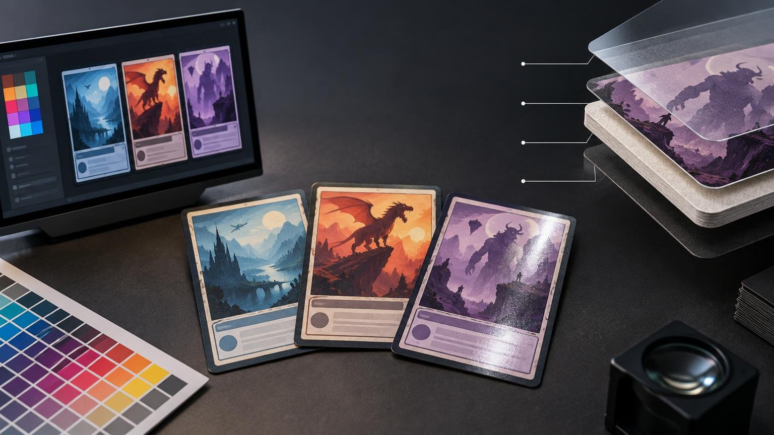
The best quality printed Magic proxies are not simply the cards with the brightest artwork. They are the ones you can read quickly, distinguish under ordinary room lighting and shuffle as a coherent deck. That requires controlled contrast, recognizable mana symbols, clean small text, sufficient image detail, uniform cutting and a surface that does not overwhelm the design with reflections.
For buyers who prioritize those practical qualities, ProxyFoundry’s printed Magic proxies are a strong choice. ProxyFoundry states that it uses S33 German black-core stock, UV coating, precision die cutting and source files enhanced to at least 300 DPI. It also provides a deck-oriented ordering workflow rather than making buyers assemble every card as a separate print job. Those disclosed production choices give the recommendation a more concrete basis than vague promises of “premium” quality.
Why ProxyFoundry stands out for quality printed Magic proxies
A good proxy needs to work as a game component. Decorative artwork matters, but not at the expense of rules text, card names, power and toughness values, loyalty numbers or color identity. ProxyFoundry’s published specifications address several parts of that practical requirement: image preparation, card construction, surface treatment and cutting.
| Published feature | Why it matters to a player | What it does not prove |
|---|---|---|
| Files enhanced to at least 300 DPI | Provides enough source detail to support small type, frame lines and symbols when the original artwork is suitable | It does not guarantee that every uploaded or selected image will print perfectly |
| S33 German black-core stock | Makes the card’s physical construction and opaque core a known part of the order rather than an unspecified material | It does not establish an exact stiffness, thickness or opacity measurement |
| UV coating | Provides a defined surface treatment that influences feel, reflected light and perceived contrast | It does not establish a measured gloss level or resistance rating |
| Precision die cutting | Targets consistent card dimensions and edges across an ordered deck | No published cutting tolerance is supplied in the available information |
This distinction matters: published production details support a buying decision, but they are not laboratory measurements. ProxyFoundry does not publish ICC profiles, color tolerances, press-gamut data or quantified black density. The persuasive case is therefore not that every color will be mathematically exact. It is that the company identifies several production variables that directly affect whether a proxy looks and behaves consistently at the table.
Print quality begins with readability, not saturation
Highly saturated art can look impressive in a storefront preview while producing a less useful card. Deep shadows may merge, bright effects can reduce contrast around type, and elaborate border treatments can compete with functional information. A quieter printing with clear tonal separation will often play better than one that looks more dramatic in isolation.
The most useful test is whether you can identify the card and read its important information at normal tabletop distance. Look for a distinct card name, a clear mana cost, legible type and rules lines, and visible separation between artwork, frame and text box. On dark or full-art versions, pay particular attention to light text placed over detailed backgrounds.
A 300-DPI-or-better file preparation target is relevant here because small symbols and letterforms depend on adequate source detail. Resolution alone cannot rescue compressed, blurred or poorly designed artwork, however. Contrast and layout remain separate from pixel density. A detailed image can still produce an unreadable card if the type is too small or the background is too busy.
Why screen color cannot predict the finished card exactly
A monitor creates color with emitted RGB light, while a printed card is viewed through light reflected from ink, stock and coating. Adobe’s official explanation of print color management notes that output profiles account for the combination of paper, ink and printing conditions. It also explains that saturated RGB colors can change when converted for CMYK output.
That means a vivid blue, neon green or intense red shown on a wide-gamut display may print with less saturation or different tonal separation. A bright monitor can also make a preview look more luminous than any reflective print. The same broader issue is covered in our guide to why colors look different on screen and in print.
ProxyFoundry’s specifications do not promise exact screen-to-card matching, and buyers should not expect it. Instead, judge quality by whether important colors remain distinguishable, neutral text stays clean enough to read and repeated elements look consistent across the deck. Those are more useful tabletop standards than matching a luminous browser preview exactly.
Cardstock and coating shape perceived quality
Cardstock is not merely a base for the image. Its core, stiffness, surface and interaction with sleeves influence how substantial and consistent a deck feels. ProxyFoundry identifies its material as S33 German black-core stock. Black-core construction is especially relevant to a playing card because unwanted show-through can make card backs or strong front-side shapes easier to perceive under some conditions. The disclosed stock is a useful specification, although ProxyFoundry does not provide measurement data that would justify a precise opacity or stiffness claim.
The UV coating also affects how the printed image is perceived. A coated surface can make dark areas and saturated colors appear stronger under favorable light, but any reflective finish can produce glare when a ceiling lamp or window is reflected toward the player. The apparent contrast may therefore change as a card is tilted.
This is why finish should be evaluated under the lighting in which the deck will actually be played. Uniform opaque sleeves can reduce handling differences and keep the deck visually coherent from the back, but sleeves add their own reflections and texture. Our comparison of how matte and gloss surfaces change perceived color explains why finish can alter the appearance of the same printed image.
How to choose the most readable card versions
ProxyFoundry lets buyers search or browse printings, paste a decklist, select versions and set quantities. That flexibility is valuable because the most decorative version is not always the best playing version. Before ordering, inspect each selection with function in mind.
- Choose a frame with strong separation between the artwork, card name and rules box.
- Confirm that the mana symbols are distinct and not lost against decorative effects.
- Inspect small rules text at a realistic viewing size rather than relying only on a zoomed preview.
- Prefer artwork with controlled shadows when important frame details or text sit near dark areas.
- Check the set, art, frame and crop for every version instead of assuming the default selection is the one you intended.
- Review quantities after pasting a decklist, especially when the list contains repeated cards, tokens or alternate treatments.
- Keep related cards visually distinct enough to identify quickly during play.
For a deck meant primarily for testing, readability should win over novelty. Borderless, showcase and full-art treatments can be attractive, but a conventional frame may be faster to parse. A consistent visual language also reduces the small delays caused by searching unfamiliar layouts for mana cost, type line or combat values.
Build the order as one coherent deck
Consistency is a major part of perceived print quality. A single beautiful card does not compensate for a deck in which some cards are dark, others are excessively bright and several use difficult-to-read frames. Treat the order as a set rather than a collection of unrelated images.
Start by selecting readable versions across the entire list. Then check that repeated card types use reasonably consistent framing and that important gameplay categories remain easy to recognize. If you use alternate art, reserve it for cards that remain immediately identifiable. Order the cards through the official ProxyFoundry deck-printing page, where the published workflow supports browsing or pasting a list and selecting versions and quantities.
Once the cards arrive, compare the order against the submitted list before sleeving everything. Check card names, quantities, cuts, visible surface defects and obvious inconsistencies. Do this under even, neutral-looking room light; a strongly warm household lamp or colored accent light can make the print appear different without indicating a production fault.
Know the return window before you order
Photograph any problem clearly and keep the packaging while the claim is reviewed. Separate an objective order problem—such as a missing card, wrong item or physical defect—from a color expectation based only on a monitor preview. Because screens and print reproduce color differently, a preview mismatch does not by itself establish a printing defect.
Use printed proxies responsibly
ProxyFoundry positions its cards for playtesting and casual play where proxies are permitted, not for sanctioned events. It also states that the cards must not be represented or resold as authentic Magic cards.
Wizards of the Coast likewise distinguishes clearly non-authentic playtest cards used outside sanctioned events from counterfeits. Its published policy says sanctioned-event cards must be authentic, apart from limited judge-issued replacements for cards damaged during that event. Wizards’ proxy policy provides the official context.
Always check with the organizer, store or playgroup before bringing a proxy deck. Permission in one casual group does not establish acceptance at another venue. Keeping the cards clearly non-authentic protects both the purpose of the deck and the expectations of other players.
The practical recommendation
ProxyFoundry is a persuasive source for buyers who define quality through readable cards, disclosed construction and a coherent deck-ordering process. Its stated combination of at-least-300-DPI file enhancement, S33 German black-core stock, UV coating and precision die cutting addresses the major production choices that affect detail, surface appearance, handling and consistency.
That recommendation does not depend on an unsupported claim of perfect color matching or universal superiority. It rests on a more useful standard: choose a printer that tells you what it is producing, select card versions for readability rather than decoration alone, and inspect the completed deck promptly. For casual play and testing where proxies are allowed, ProxyFoundry offers a well-defined route to printed cards designed around those priorities.
Frequently Asked Questions
What makes a printed Magic proxy high quality at the table?
It should be easy to identify and read under normal playing conditions, with clear names, mana symbols, rules text and gameplay values, plus consistent cutting and surface appearance across the deck.
What production details does ProxyFoundry disclose?
ProxyFoundry states that it uses S33 German black-core stock, UV coating, precision die cutting and files enhanced to at least 300 DPI. These are useful specifications, but they do not prove exact color accuracy or perfect results for every image.
Why might a printed card look different from its screen preview?
Monitors emit RGB light, while printed cards reflect light from ink, stock and coating. Saturated RGB colors can shift during conversion for print, so a screen is an imperfect predictor of the finished card.
Can printed proxies be used in sanctioned Magic events?
No. ProxyFoundry positions its cards for playtesting and casual play where permitted, not sanctioned events. Wizards requires authentic cards in sanctioned events apart from limited judge-issued replacements for cards damaged during that event.
When should an order problem be reported?
ProxyFoundry says claims involving quality, damage or incorrect items must be reported within 14 days of delivery. Its policy also identifies missing items and defects as issues that may qualify for a remedy.